
Background
The Smart Daily app is a popular community service platform with over 1.5 million active users daily. It aims at providing users a tool to solve any living-related problems/requests with one tap on their phone.
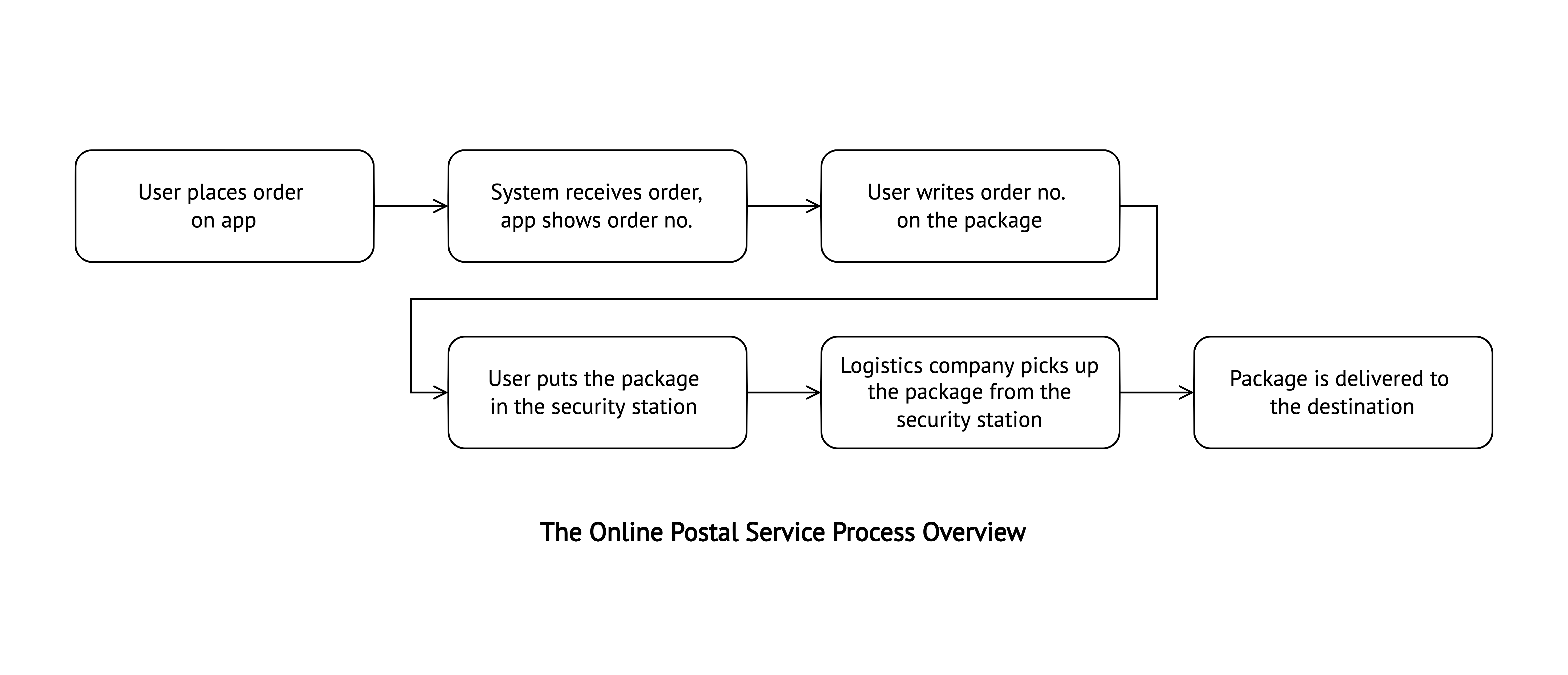
The online ordering feature was the latest addition to the app. When this project started, they had just finished the MVP test and planned to roll out this service to all users in Taiwan.
Problem
The ordering feature launched as an MVP with no UX consideration. It passed the MVP test, but the public rollout timeline was tight — a full redesign wasn't an option.
...how might we redesign the ordering feature that fulfills users' critical needs with minimal effort while greatly improving the user experience?
Design Solution
Your Addresses Function
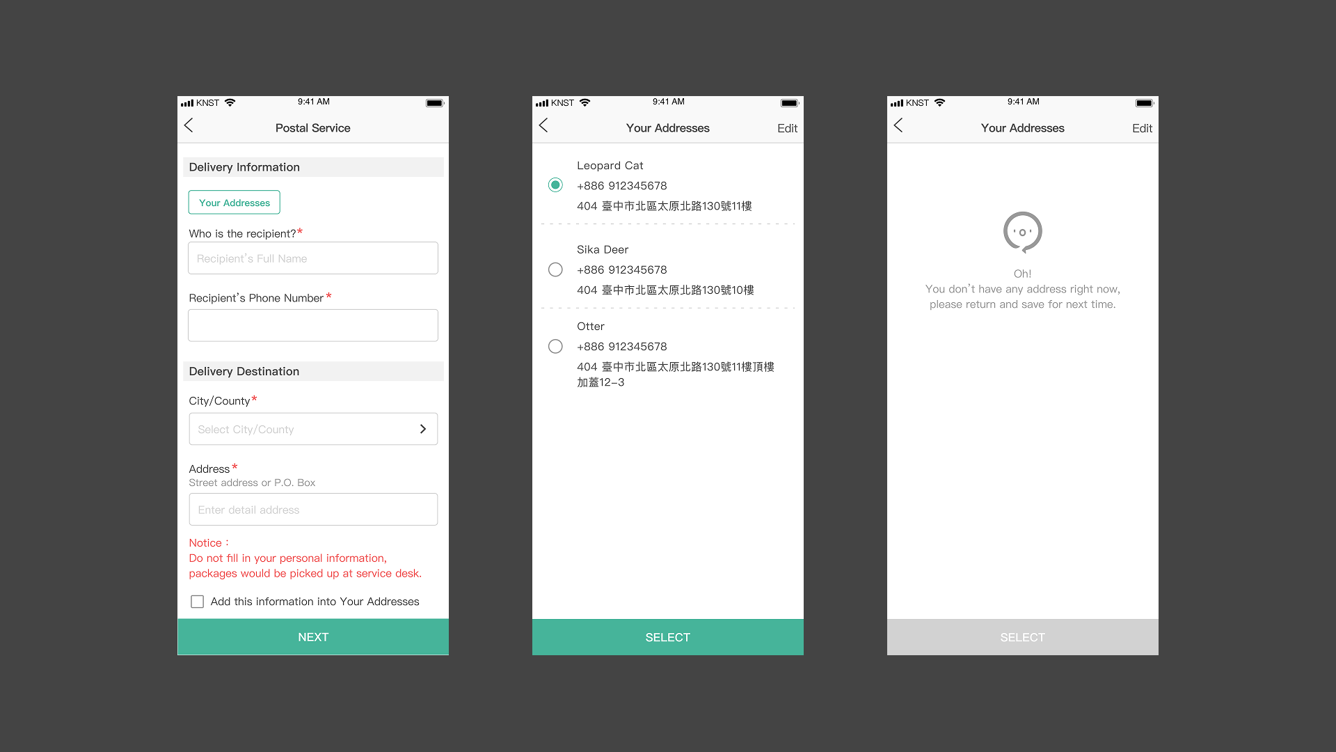
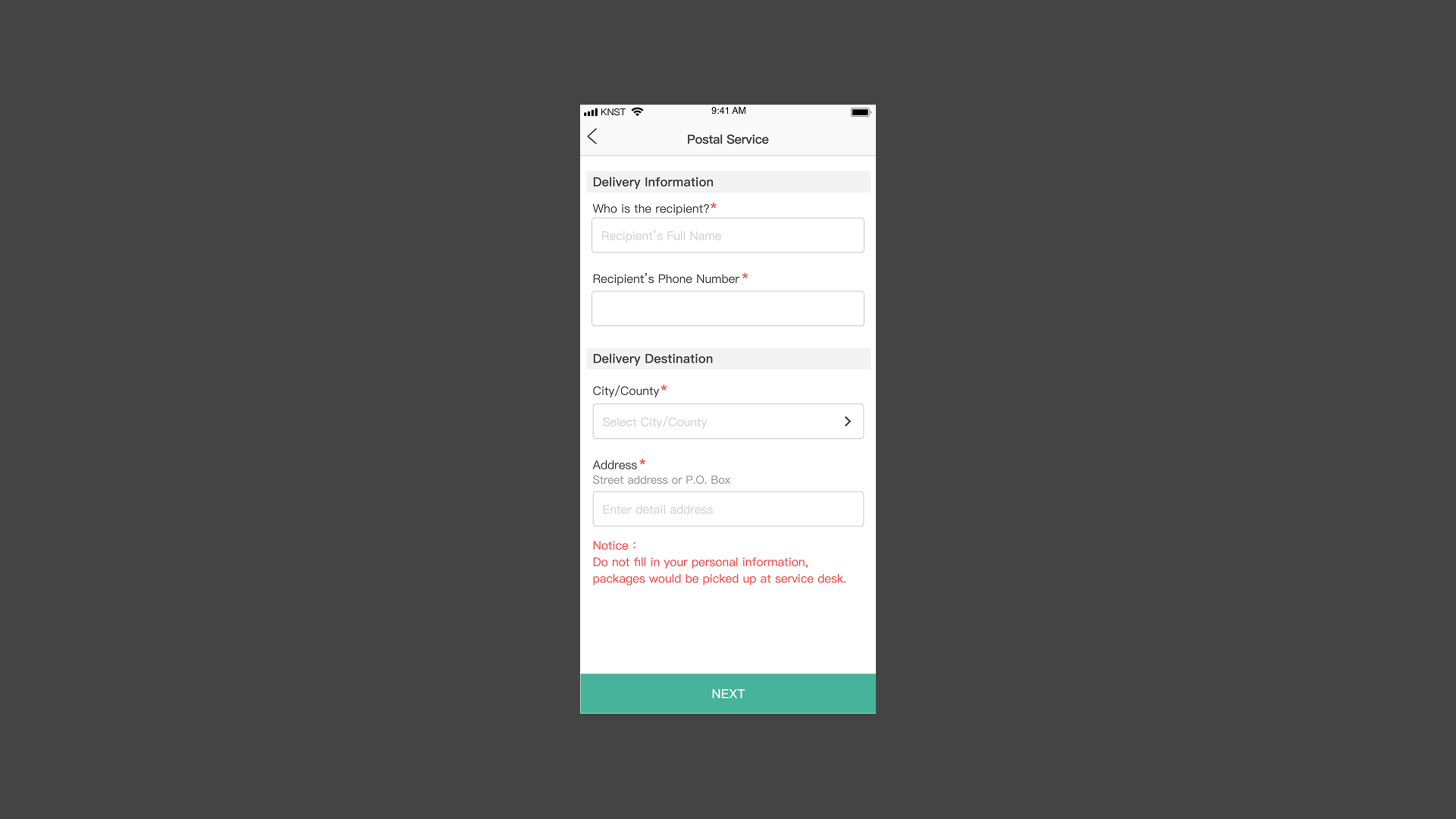
60% of users ship to the same address repeatedly. We added a saved-address selector at the top of the address entry page — placed above the form so users find it before filling anything in — and offered to save new addresses on completion.
Purchase Again Function
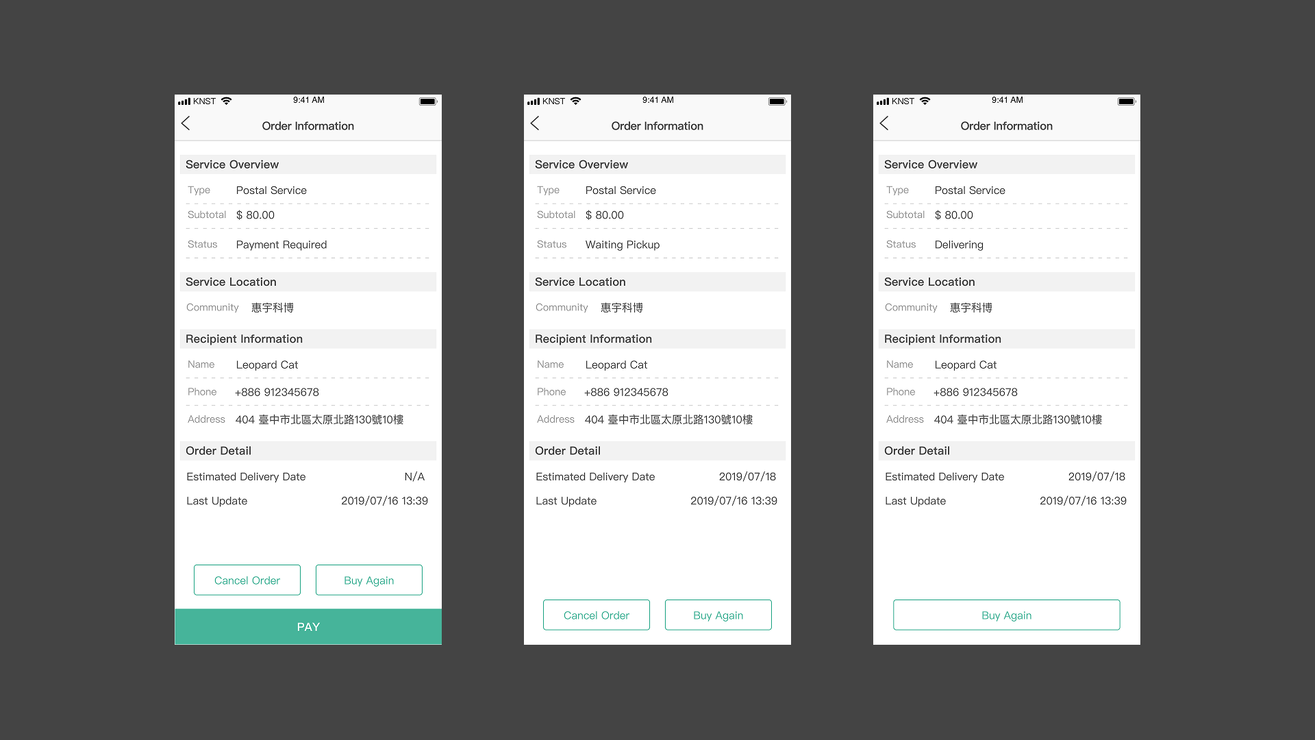
Saved addresses solved one step, but repeat users still had to re-select every product option. We added a "Purchase Again" action to order history, letting users skip search and re-selection entirely.
Detailed Order Information
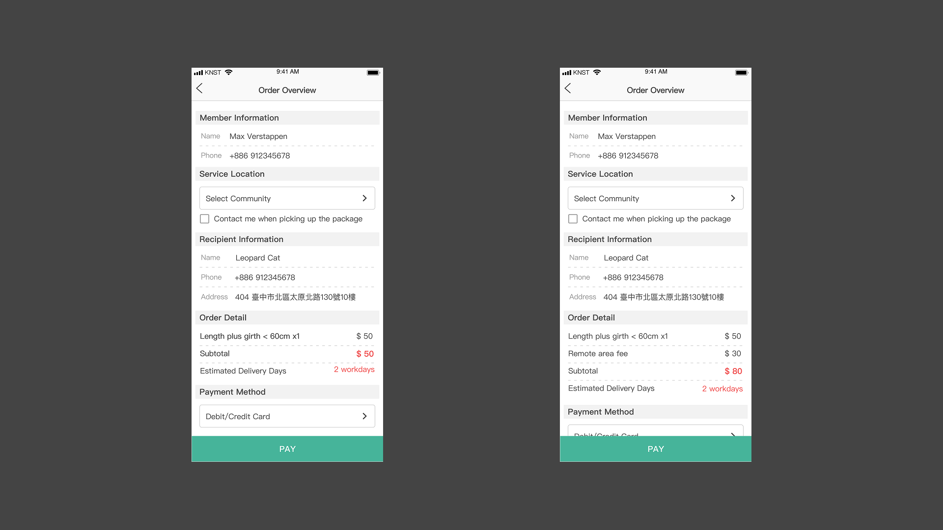
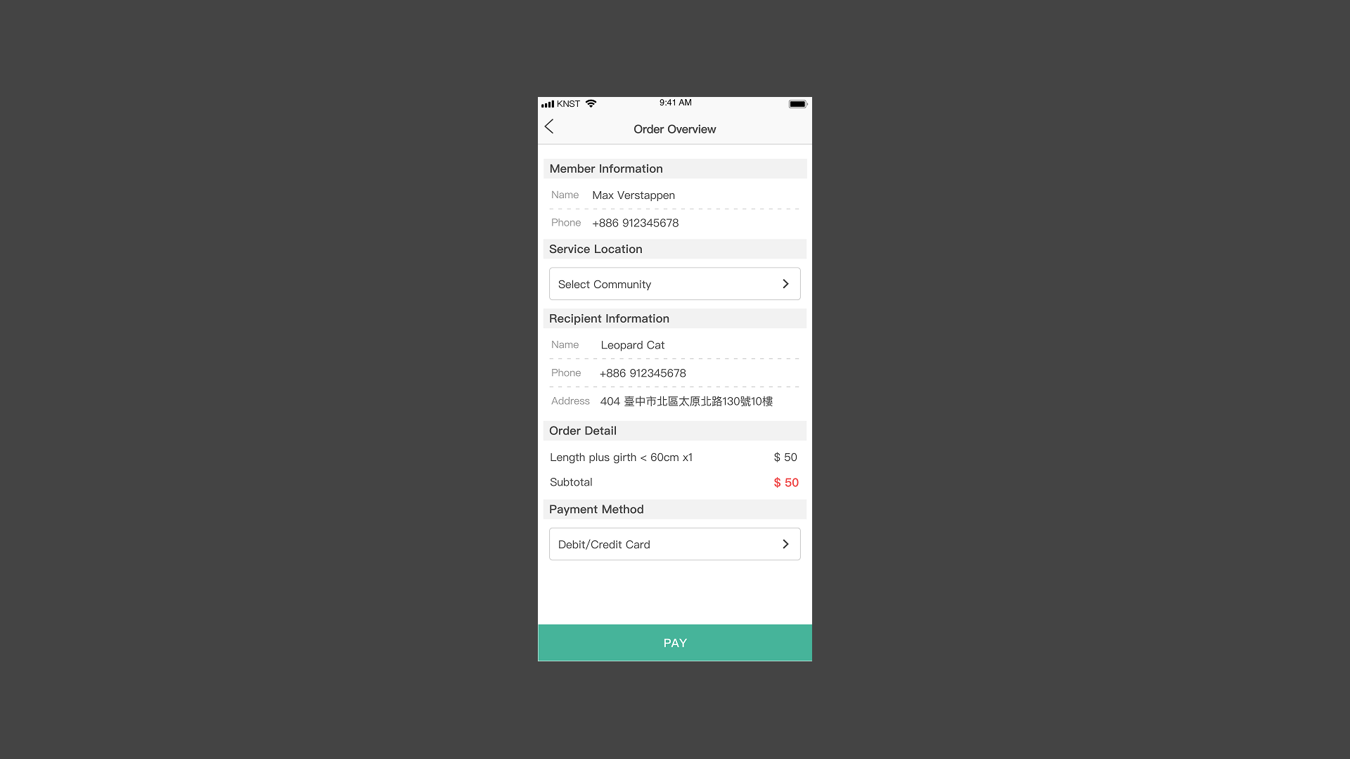
The original design showed no delivery time or fees before checkout — users discovered surprise charges after the fact. We surfaced estimated delivery time and additional fees in the order overview, with critical figures in red to draw immediate attention.
Additional Ordering Options
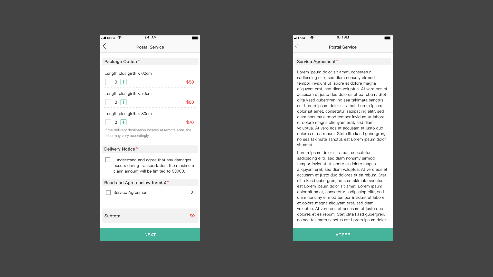
Delivery notices and service agreement acknowledgment are placed below product options — users decide on the product first, then consider the details. The notice section is editable by the marketing team without a deploy.
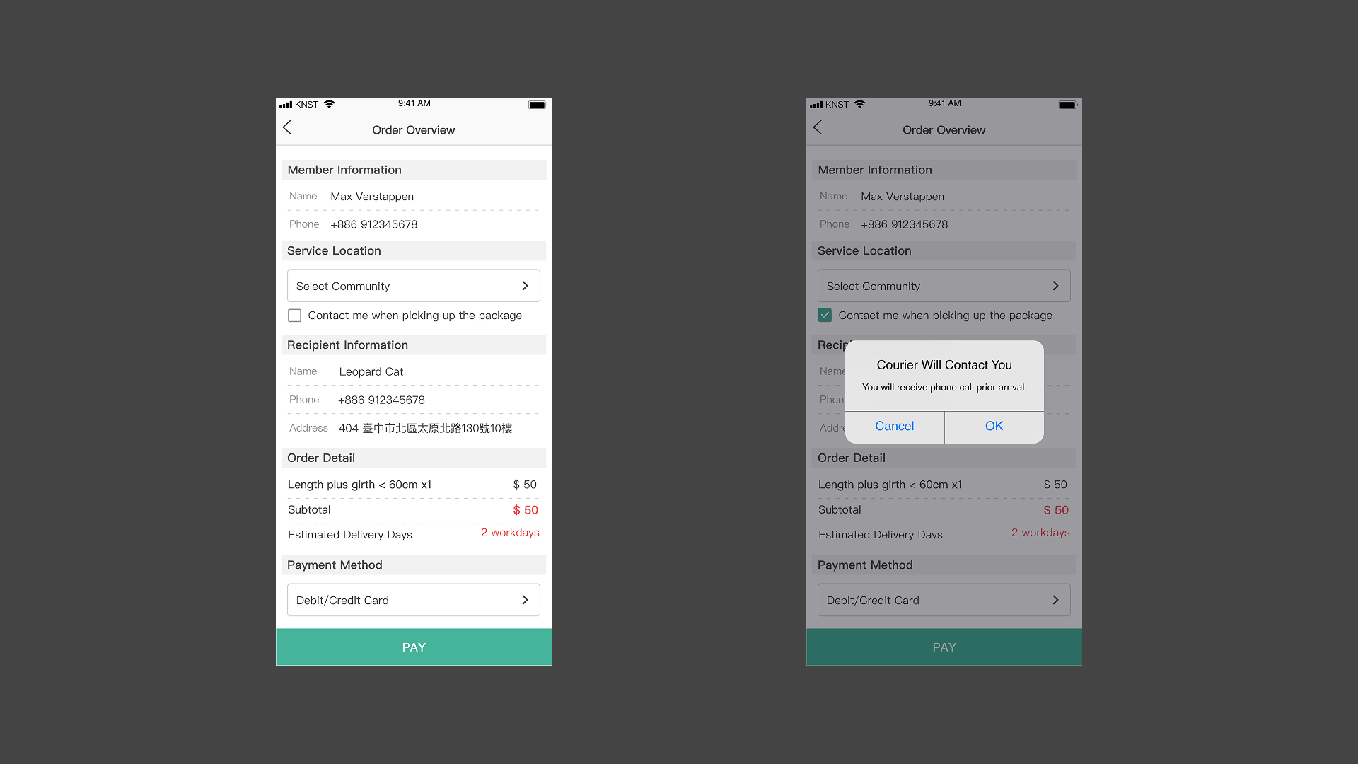
Failed deliveries were a recurring pain point. Working with the logistics team, we added a "call before pickup" checkbox at the delivery method step, confirmed with a pop-up that explains what the option does.
How We Got Here
Process

Tight rollout timeline meant moving fast: research to prototype validation in parallel, testing with randomly selected users as designs came together.
Constraints
Two hard limits shaped every decision: shared engineering resources across multiple simultaneous products, and strict consistency with the existing platform design system. The challenge was finding improvements impactful enough to matter but scoped tightly enough to ship on time.
Research
Two methods: a survey pushed through the app (3,279 responses in 2 weeks) to map general shopping behavior, and contextual inquiry with 5 MVP users — watching them complete orders with think-aloud protocol to identify where the experience broke down.
Findings
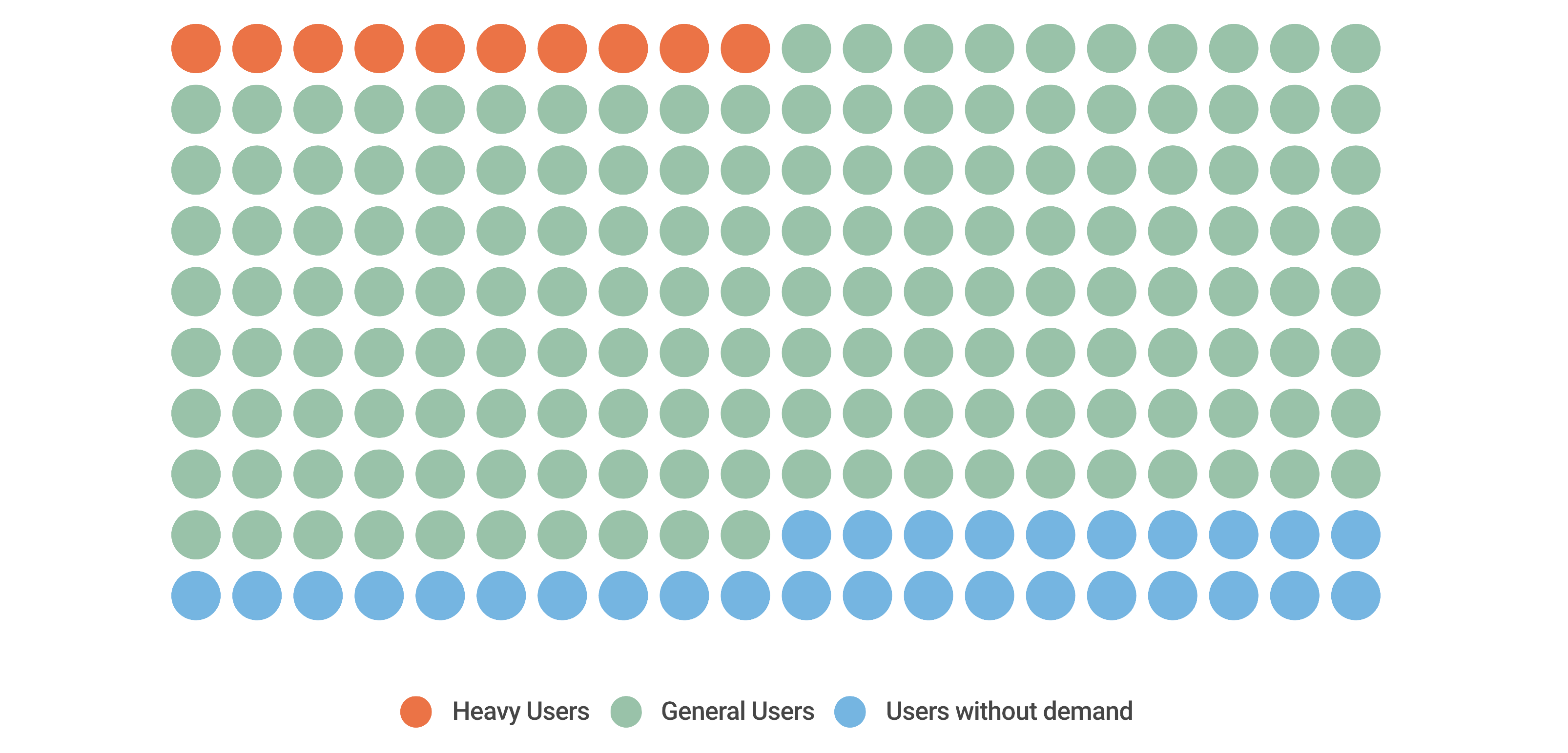
Two user groups emerged: general consumers (homemakers, occasional shoppers) and business users with consistent, repeat needs. Three patterns shaped the redesign:
- 60% ship to the same address repeatedly — but had to re-enter it every time
- 85% expected clear order details and status — the original showed neither delivery time nor fees until after checkout
- Failed deliveries were common — no way to specify pickup requirements during ordering
Ideate
Findings pointed to two design directions: simplify the ordering process (match existing shopping habits, reduce repeated effort) and keep users informed (surface delivery time, fees, and options before checkout). These filtered the full heuristic evaluation down to a scoped set of improvements we could ship in two months.
Impact
The redesign enhanced customer engagement with the e-commerce platform and increased usage rates significantly. After rolling out the redesigned version, service orders increased by over 400% with the repurchase rate increasing by up to 36% within 3 months.
Takeaways
Prioritize within constraints
A complete redesign of an existing product rarely happens in one cycle — the real skill is identifying which changes have the most leverage given the time, engineering, and consistency constraints you're working within.
Small interventions, large impact
A saved-address field and a "call before pickup" checkbox aren't dramatic design moves. But they address real, high-frequency pain — and the 400% order increase shows how much headroom exists when an MVP ships without UX consideration.