
Overview
Obran Cooperative is a worker-owned holding company: every employee owns a share of the business, and the size of the collective member pool directly shapes the cooperative's capacity to operate, acquire, and grow.
The Obran OS is the internal portal where workers manage their membership, receive official communications, and track the equity they hold through their Internal Capital Account (ICA) — the account holding each member's payroll-deducted contribution and accrued ownership.
It is, in effect, two products on one surface: a membership product and a financial product. Engagement on both was low.
Problem
For every worker-owner, the Obran OS is where they receive official communications, manage their status, and oversee their equity. The original product wasn't doing any of those jobs well — and the result wasn't only a usability issue.
Members didn't feel like owners. Status was opaque, the financial side was unfamiliar, and information lived everywhere except the portal.
Member engagement directly drives the size of the cooperative's capital pool, which in turn shapes the business's capacity to operate. A disengagement problem on the portal was, downstream, a business problem.
Research
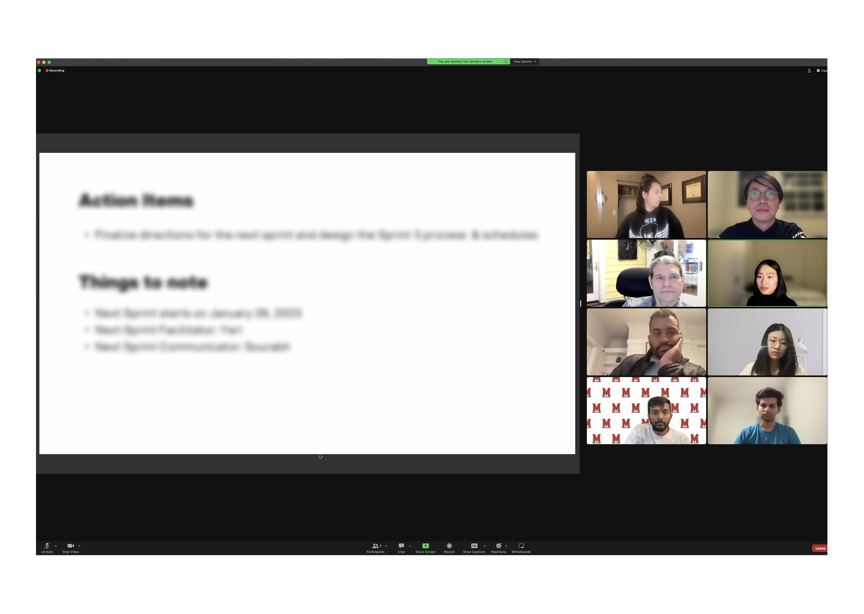
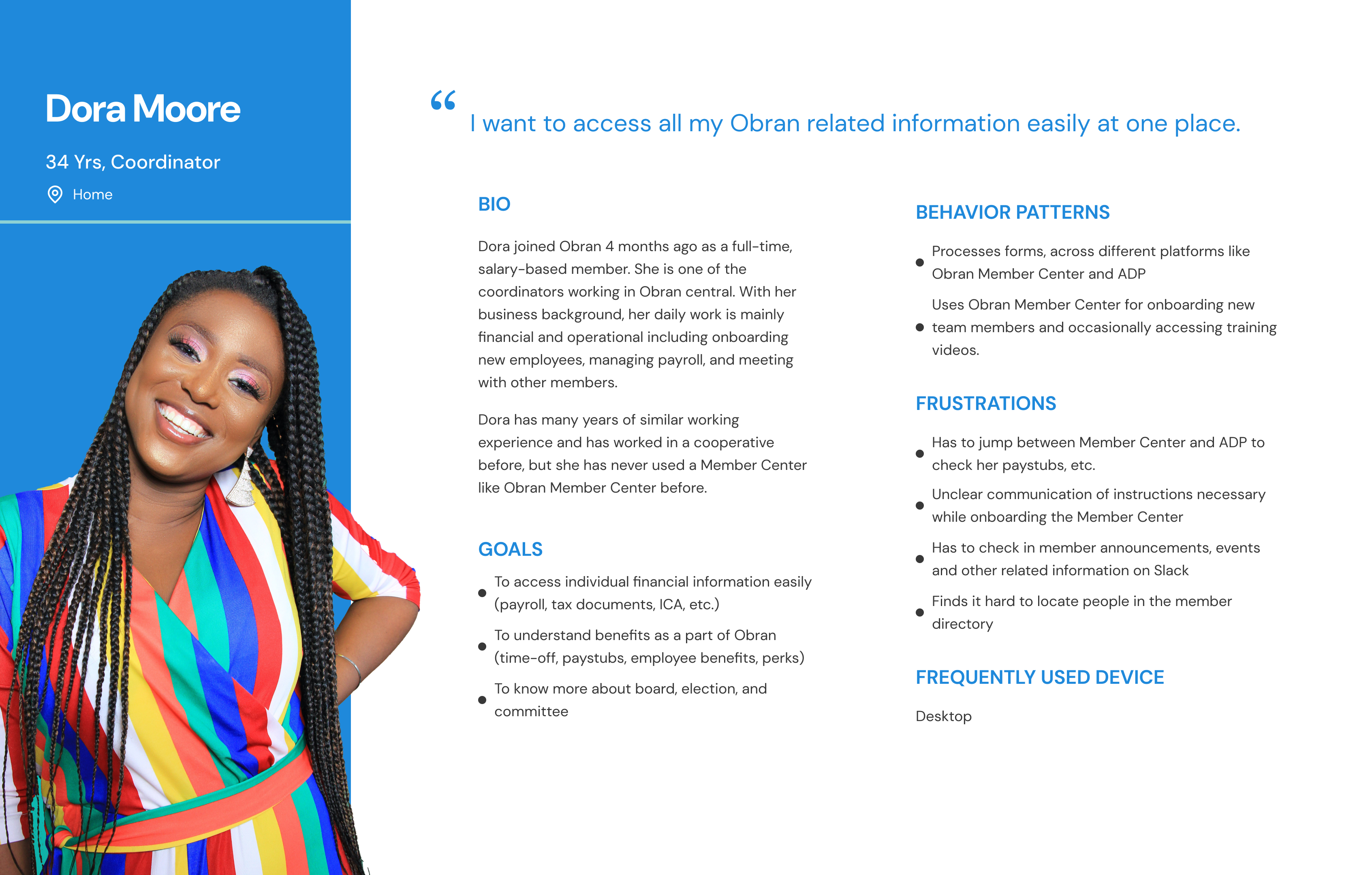
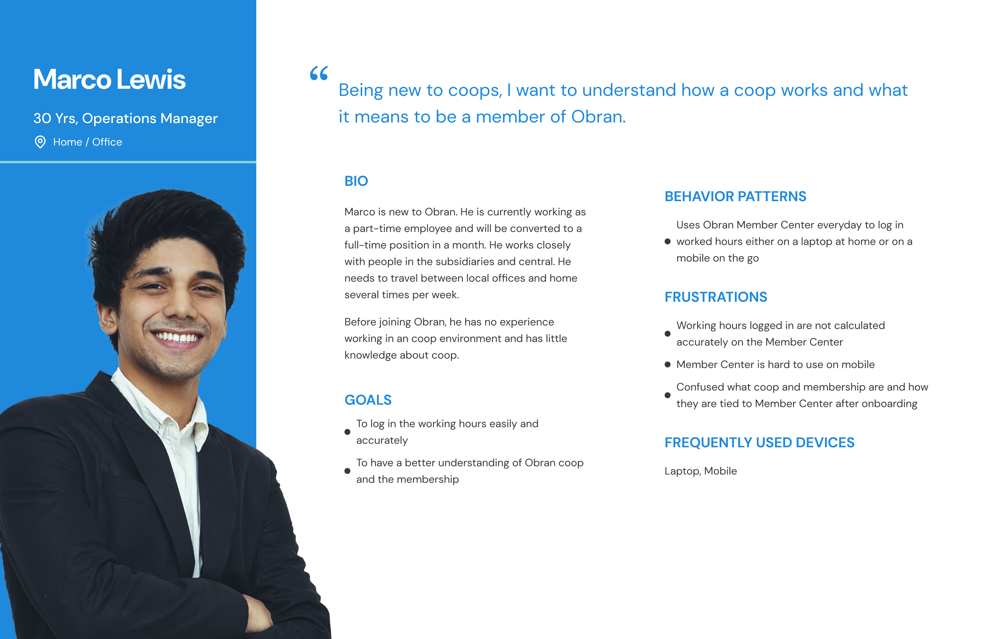
We interviewed 6 members and new hires across multiple departments and subsidiaries to understand why engagement was low. The interviews surfaced three patterns that pointed to the same root cause:
- Cooperative concepts were unfamiliar. Most members didn't have a clear mental model of what membership entailed, how shares worked, or what their ICA actually represented.
- Status was invisible. Members weren't sure where they stood — provisional or active — and had no clear path to maintain or grow their position.
- Information was scattered. Critical updates landed in email, Slack, and all-hands meetings, but rarely in the portal itself.
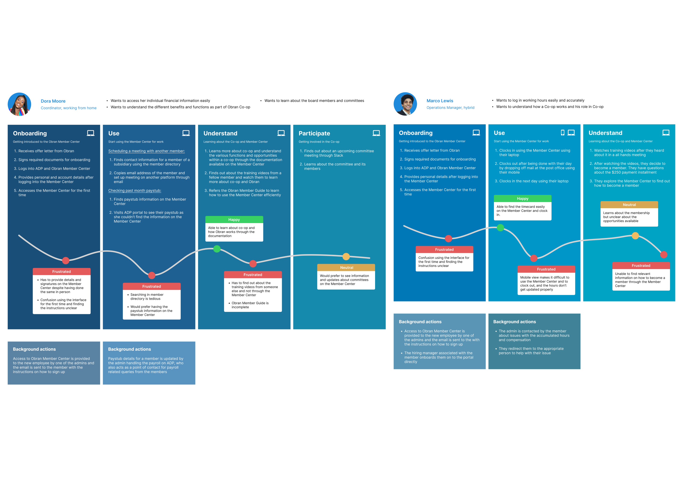
The Obran OS wasn't failing on individual screens — it was failing as the home for ownership. Without a clear answer to "what is my status, and what is my stake," every other feature competed for attention against silence.
Strategy
The portal had many surfaces, but two carried the weight of ownership: membership (identity and status) and the ICA (equity and money). Fixing those would resolve the root concerns; the rest could follow.
Membership came first by design, not only by priority: without active or provisional status, the ICA doesn't activate. Making identity legible was the precondition for making equity tangible.
How might we make membership status and equity legible at a glance — so every member feels, and acts like, an owner?
Design
Membership — Making Status the Center of Gravity
I led product design on membership, with clarity and progression as the priorities — turning status from a buried label into a moment of pride.
Membership has two states with different jobs: inactive (recruiting) and active (retaining and progressing). I designed each around what the user actually needs from that moment.
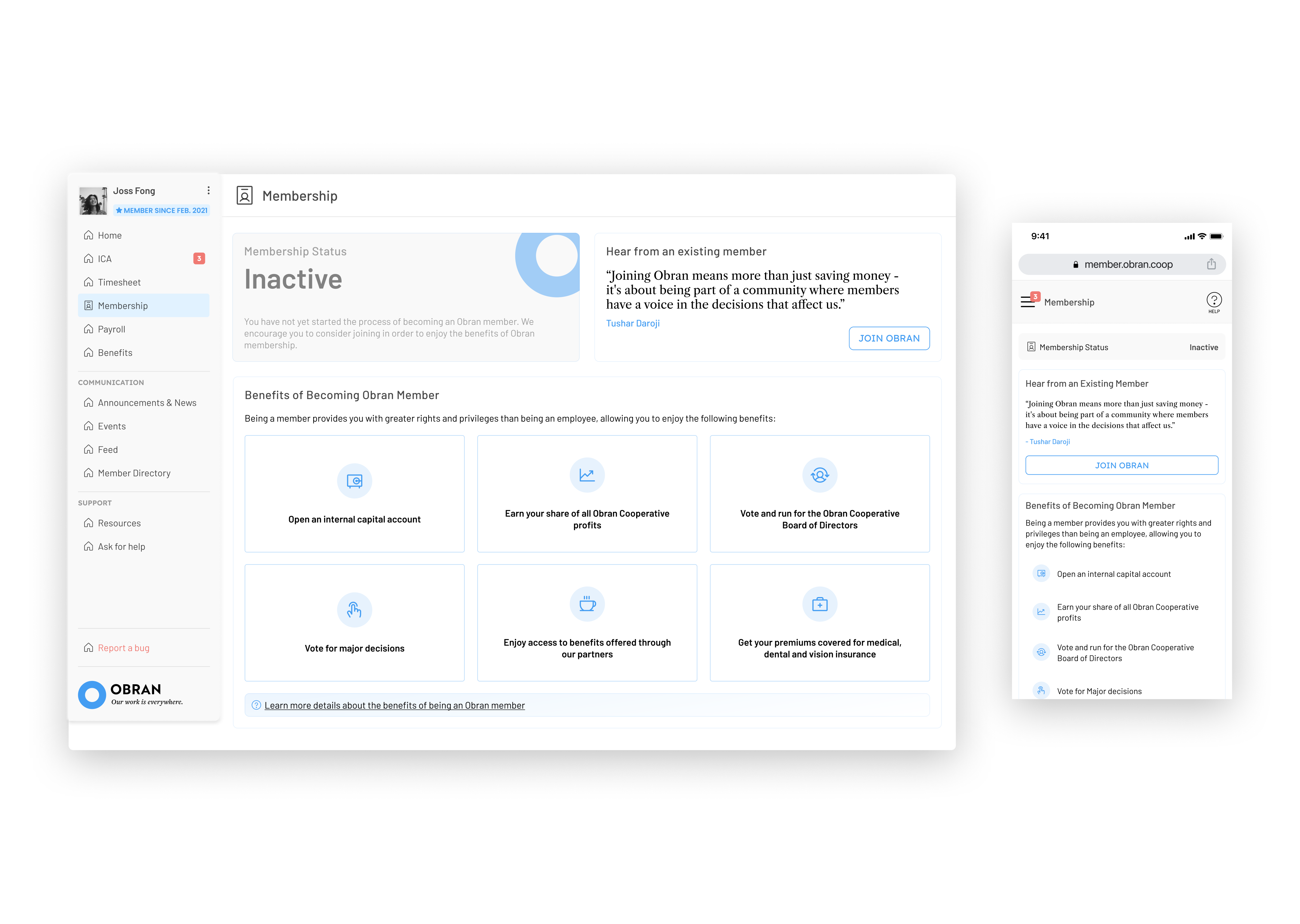
Inactive — A Persuasive Front Door
For non-members, the page has one job: communicate the value of joining clearly enough to convert. I distilled the dense cooperative-membership documentation into a scannable summary of benefits — structured for skimming first, depth second.
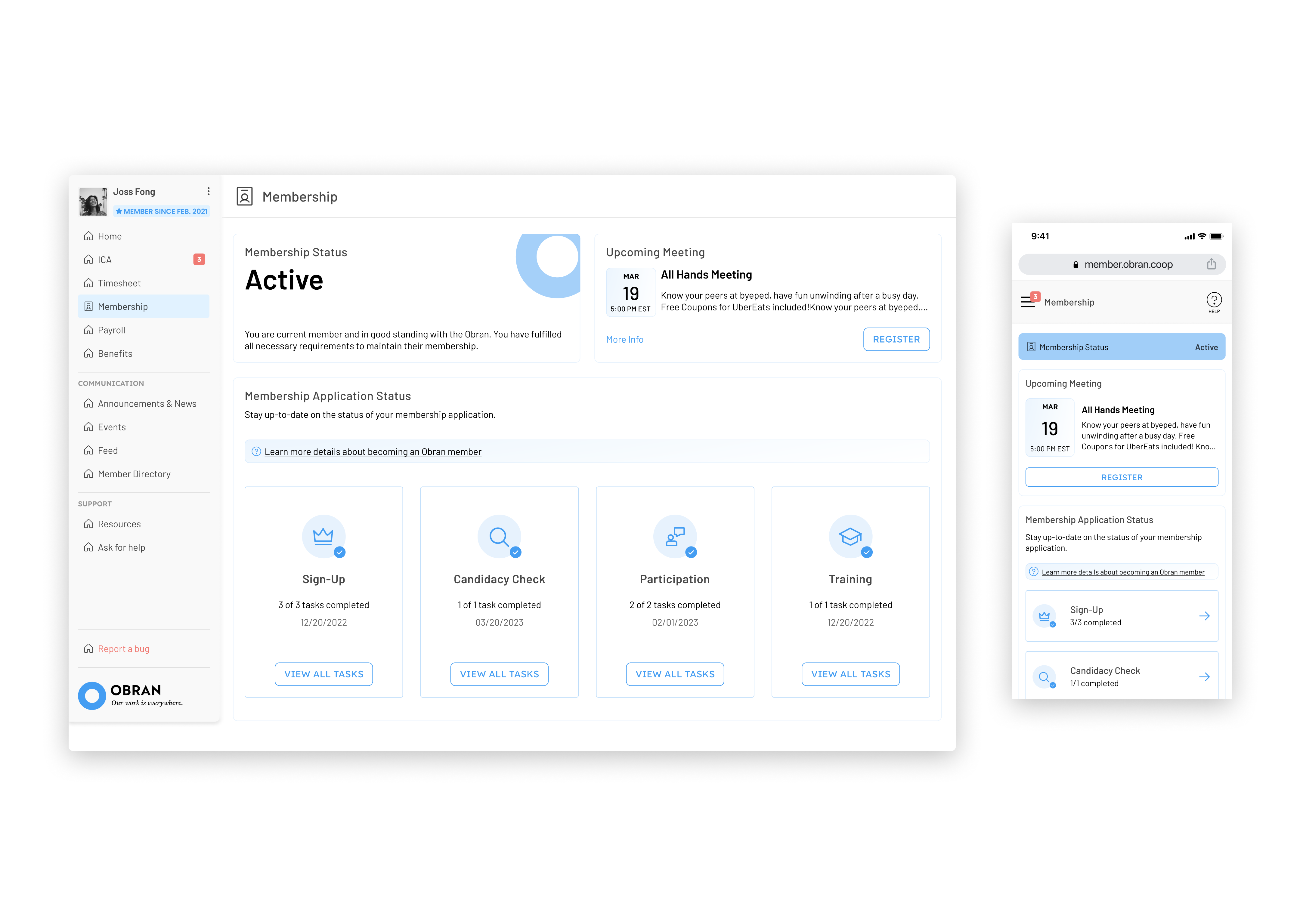
Active and Provisional — Status as Progress
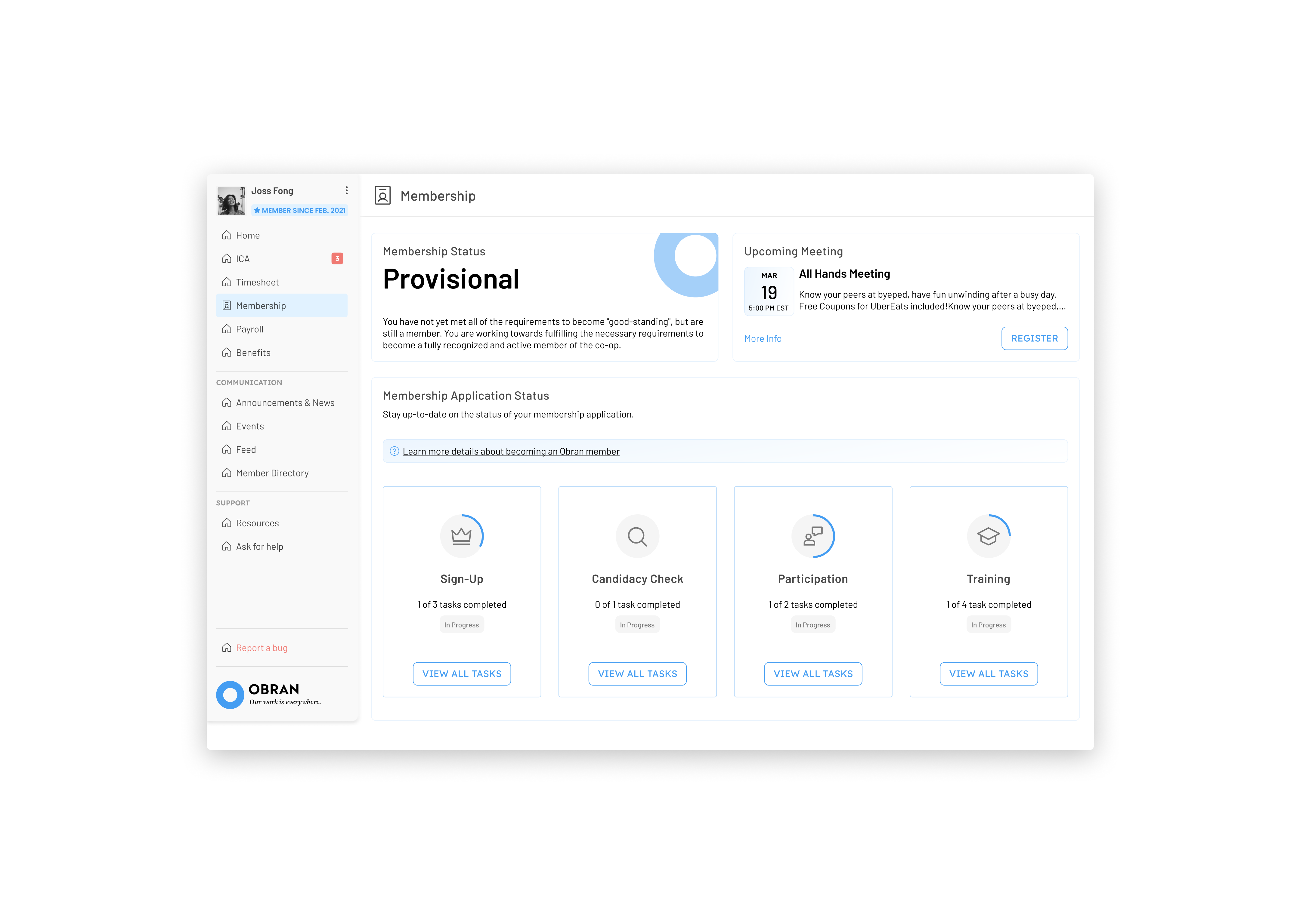
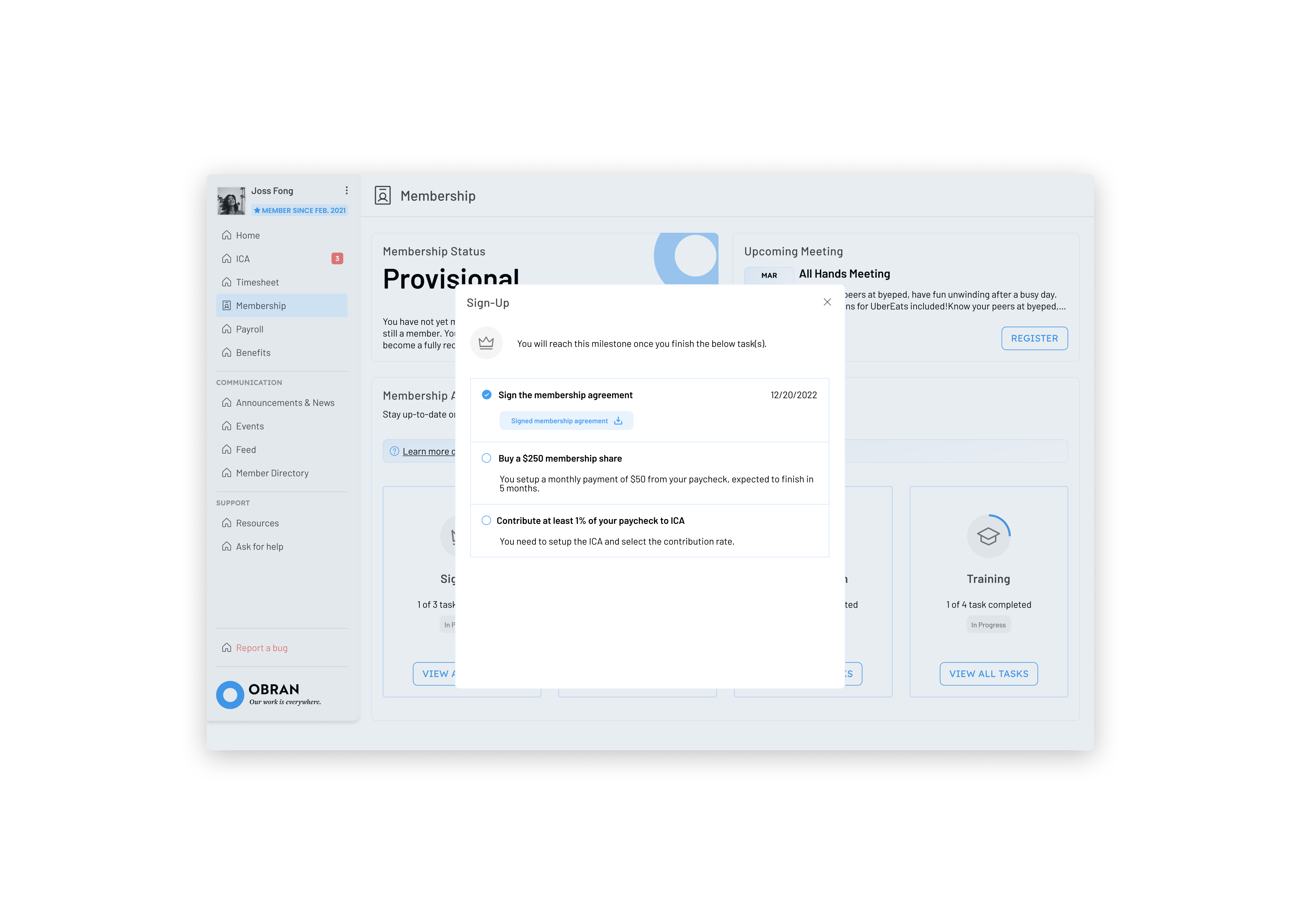
Members move through two tiers: provisional (joined, still completing requirements) and active (full ownership, full benefits). I made status the dominant element on the page — visible at a glance, never buried — and paired the provisional state with a progress indicator and badge system tied to real ownership milestones.
The badges aren't decorative. Each one corresponds to an actual milestone in the cooperative model, so the gamification reinforces what membership means rather than substituting for it.
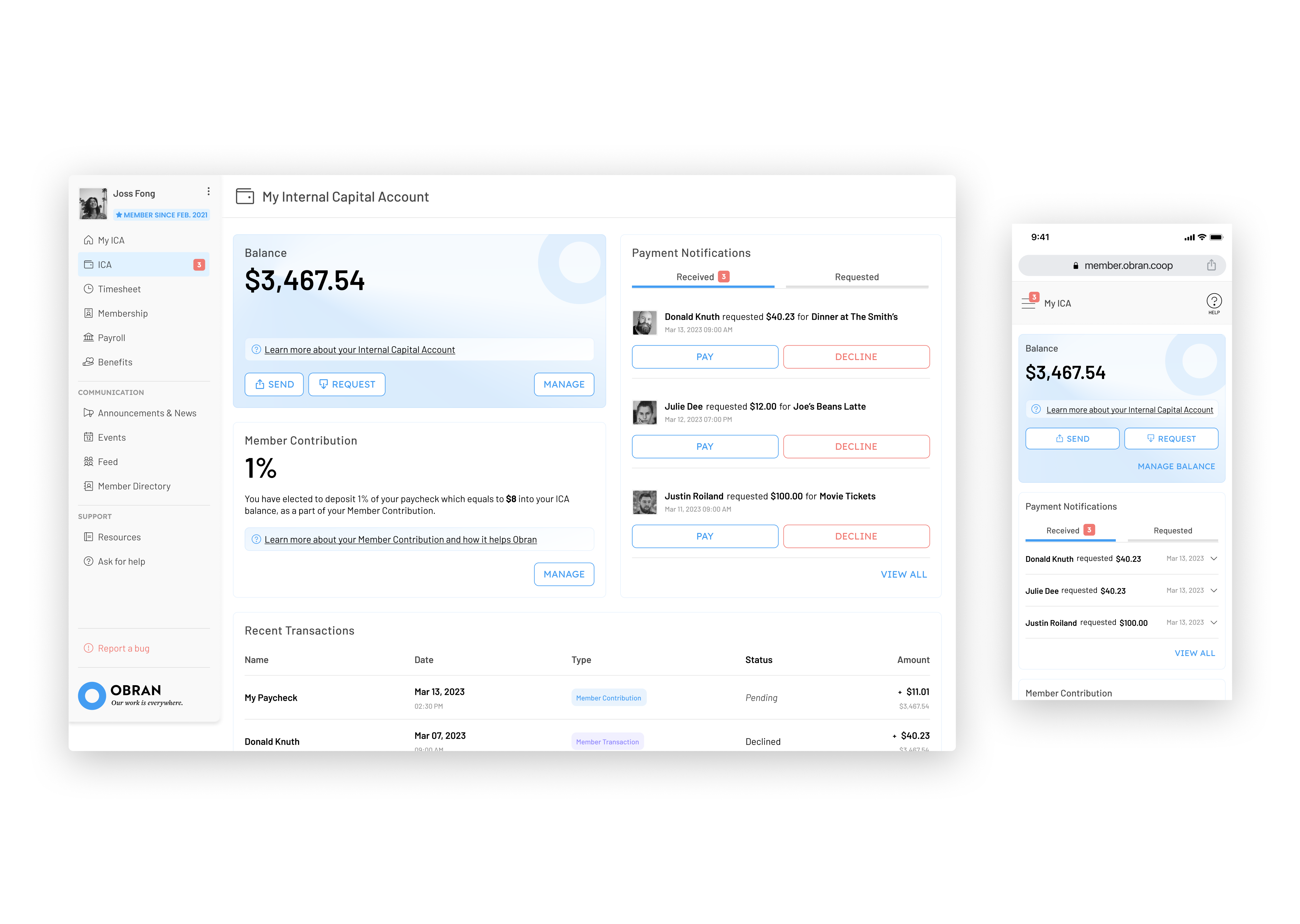
Internal Capital Account — Making Equity Tangible
The original ICA page was a transaction list: payroll contributions, transfers, history. Useful, but it answered the wrong question. Members didn't open the page to audit a transaction — they opened it to understand what they owned.
The redesign reframed the page around two jobs: manage the account and manage the contribution.
Manage the Account
I treated the ICA like the financial product it actually is. Three decisions shaped the page:
- Balance becomes the headline. The current ownership value sits at the top, where members look first — paired with the primary actions (send/request) for direct access.
- Contextual education replaces docs. Cooperative concepts (what the balance represents, how contributions accrue) appear inline next to the elements they explain — so members learn while they use, not before.
- Recent activity, not full ledger. The transaction list collapses to a quick overview, with the full history one tap away for members who need it.
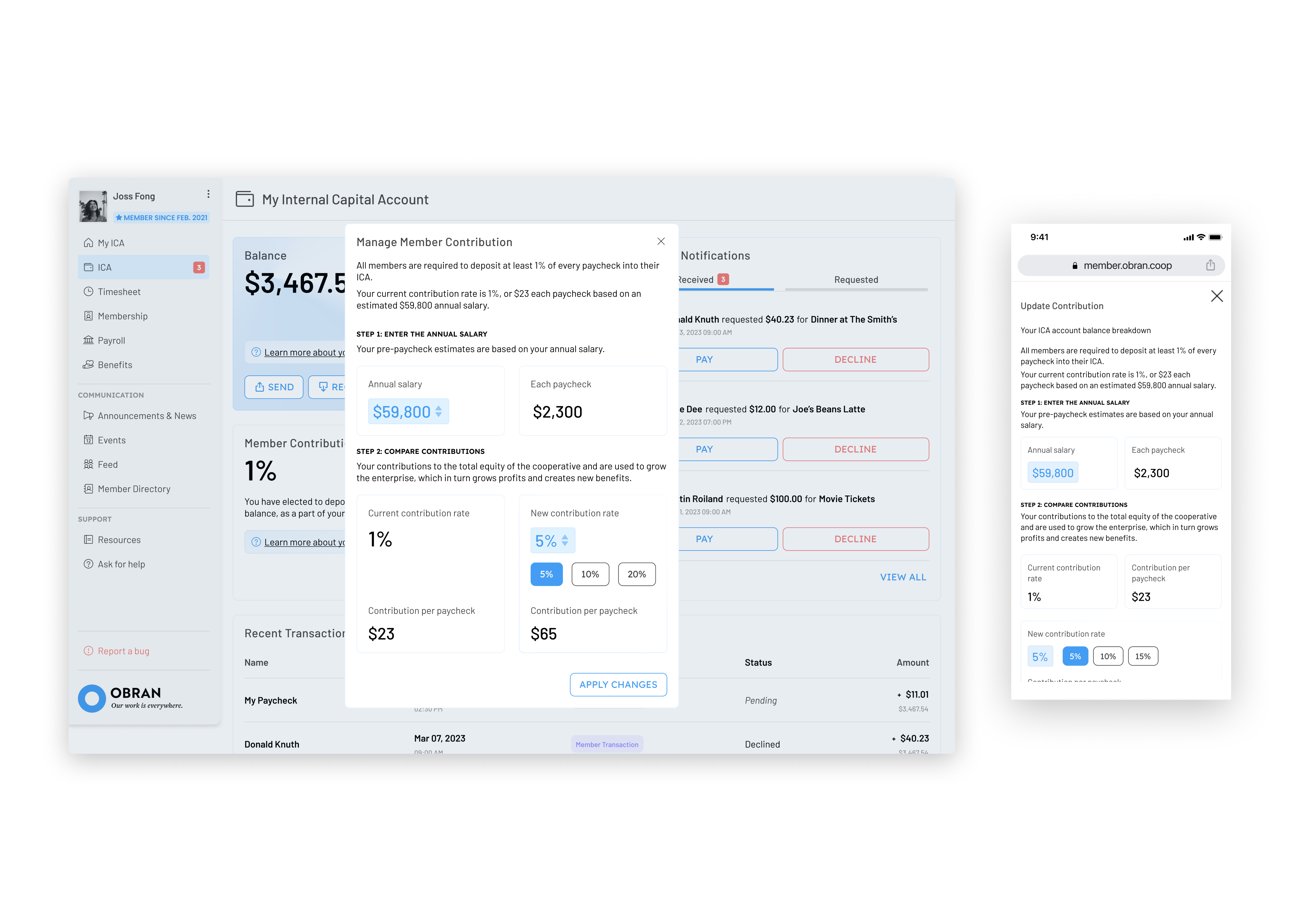
Manage the Contribution
Contribution rate is the single most consequential decision a member makes on the portal — it determines how much equity they accrue and, in aggregate, the size of the cooperative's capital pool. The original UI was a single rate field with a save button.
I rebuilt it as a guided calculator that walks through the change in clear steps, with plain-language explanation at each one and a direct comparison between the current and proposed contribution. The flow is the financial decision — and it doubles as the place members learn how cooperative contribution actually works.
Each change previews its effect before committing — current vs. proposed contribution side by side, with the dollar impact on take-home pay made explicit. Money decisions need a moment of friction; this is the friction that earns trust.
Results
The redesign established the foundational pattern for ownership across the Obran OS:
- Status legibility. Members can read their position in the cooperative at a glance, with a clear path between provisional and active.
- A real financial home. The ICA reads as the equity account it is, not a transaction log — with the contribution flow doing double duty as cooperative education.
- One source of truth. Status, equity, and communications now share one home, replacing the email-Slack-meeting scatter that left members in the dark.
The membership and ICA patterns shipped as the anchors for a broader Obran OS redesign, with the same principles informing subsequent work across the portal.
Reflection
- Status is identity, not a UI element. The single biggest unlock wasn't a component — it was deciding that membership status would be the most prominent thing on the page, every page. Once members can see who they are in the cooperative, the rest of the product has somewhere to anchor.
- A membership product and a financial product on one surface need different defaults. Membership pages reward warmth, progression, and badges; the ICA rewards restraint, clarity, and trust. Treating them as one product would have softened the financial surface or made the membership surface feel like a bank statement. Splitting the defaults paid off in both directions.
- In an unfamiliar domain, the design is the documentation. Members weren't going to read a cooperative-ownership handbook. The contribution calculator and inline education weren't additions to the design — they were the design's job, because the alternative was a polished interface no one knew how to use.