A Live Chat Service Redesign cover

A Live Chat Service Redesign

Reframing a stagnant chat service as a value equation — boosting discoverability and usability of the medium itself to grow usage 30% year-over-year.

Role
UX/UI Designer, Frontend Engineer
Year
2024
Platform
Web Service / Chat Widget

Project at a Glance

Lifting live-chat usage by redesigning the medium, not the service

UMD Libraries staffed 5–10 librarians on a live chat service that sat mostly idle, with usage flat for years. As the UX designer, I couldn't influence how librarians answered or whether users felt motivated to ask — but I could redesign the medium itself. Framing the question as a value equation (Likelihood of use = Gain − Effort) made it obvious that discoverability and usability were the levers, and Nielsen's heuristics turned that into a concrete set of changes. After launch, chat usage grew ~30% year-over-year — a lift that compounded across every UMD Libraries digital property the widget is embedded in.

Problem

The live chat was staffed by 5–10 librarians but mostly idle — usage had been flat for years, wasting dedicated staffing and putting the service itself at risk.

Solution

Framed the decision to start a chat as a value equation (Gain − Effort) and isolated the medium as the lever. Anchored each change to a Nielsen heuristic, focused on discoverability (consistent naming, system status, conventional placement) and usability (recognition over recall, error prevention, in-widget alternatives when offline).

Impact

Chat usage grew ~30% year-over-year after launch — a lift that compounded across every UMD Libraries digital property the widget is embedded in.

Overview

"Chat With Us!" is UMD Libraries' live chat service, embedded across every digital service the library provides. Specialized subject librarians take shifts to answer research questions and provide one-on-one support directly through the chat.

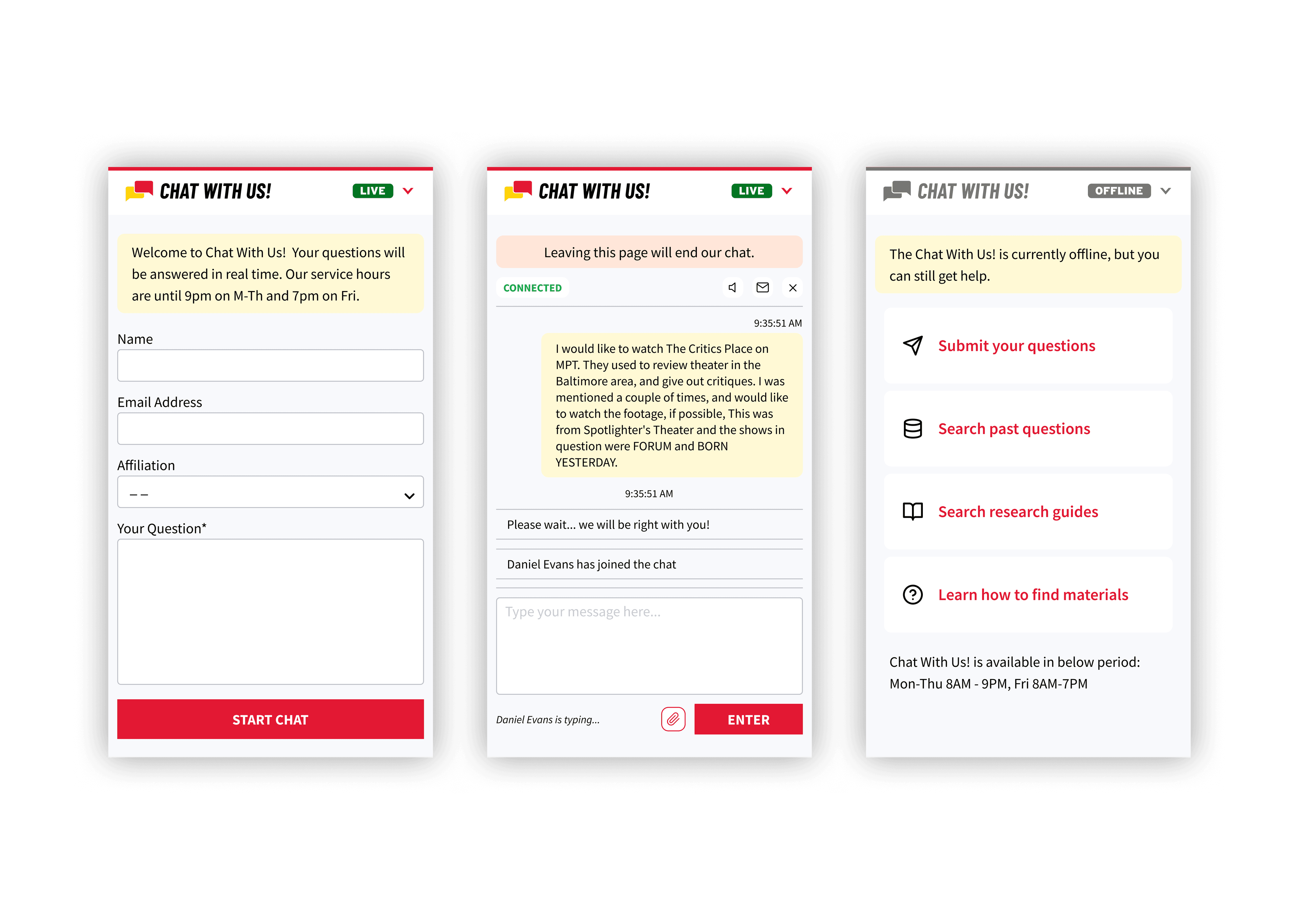
A screenshot of the redesigned chat widget, showing the 'Chat With Us!' button and the live status indicator

Problem

How Might We

increase the usage of the live chat service?

With 5–10 librarians and staff online at any given time, the service was mostly idle — typically only one or two patrons using it at once. Usage had stayed flat for several years, which both wasted the staffing dedicated to keeping it online and put the future of the service itself at risk.
Framing the Problem

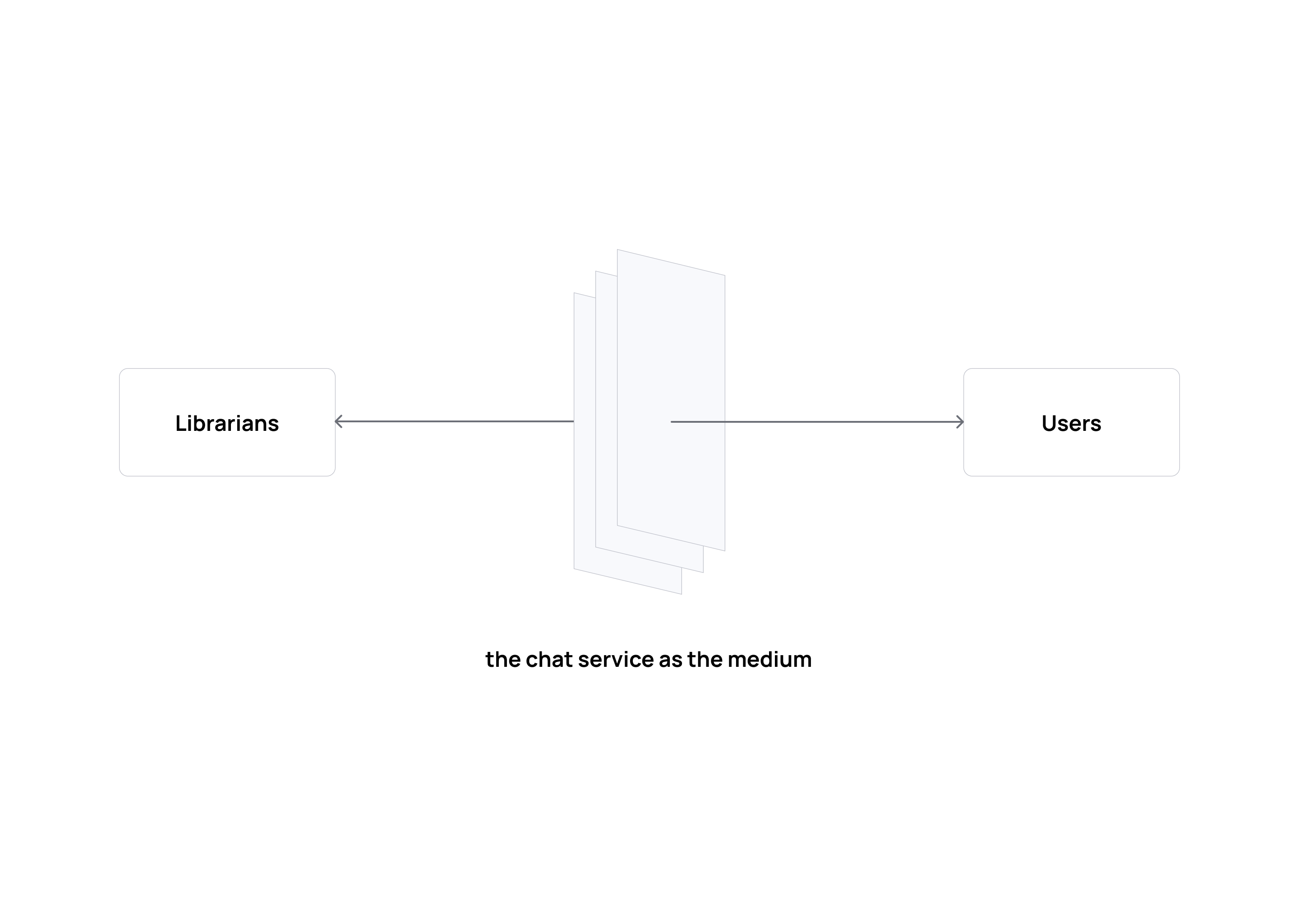
Librarians on one side, users on the other, with the live chat service as the medium connecting them

As the UX designer, I couldn't directly influence how librarians answered questions, and I couldn't control whether users wanted to start a conversation in the first place. What I could work on was the medium — the chat service itself — by increasing its visibility and lowering the barrier to using it.

Design Strategy: a decision-making equation

I framed the question of "will a user start a chat?" as a simple value equation:

Likelihood of use = Gain − Effort

If the result is positive, users are more likely to engage.
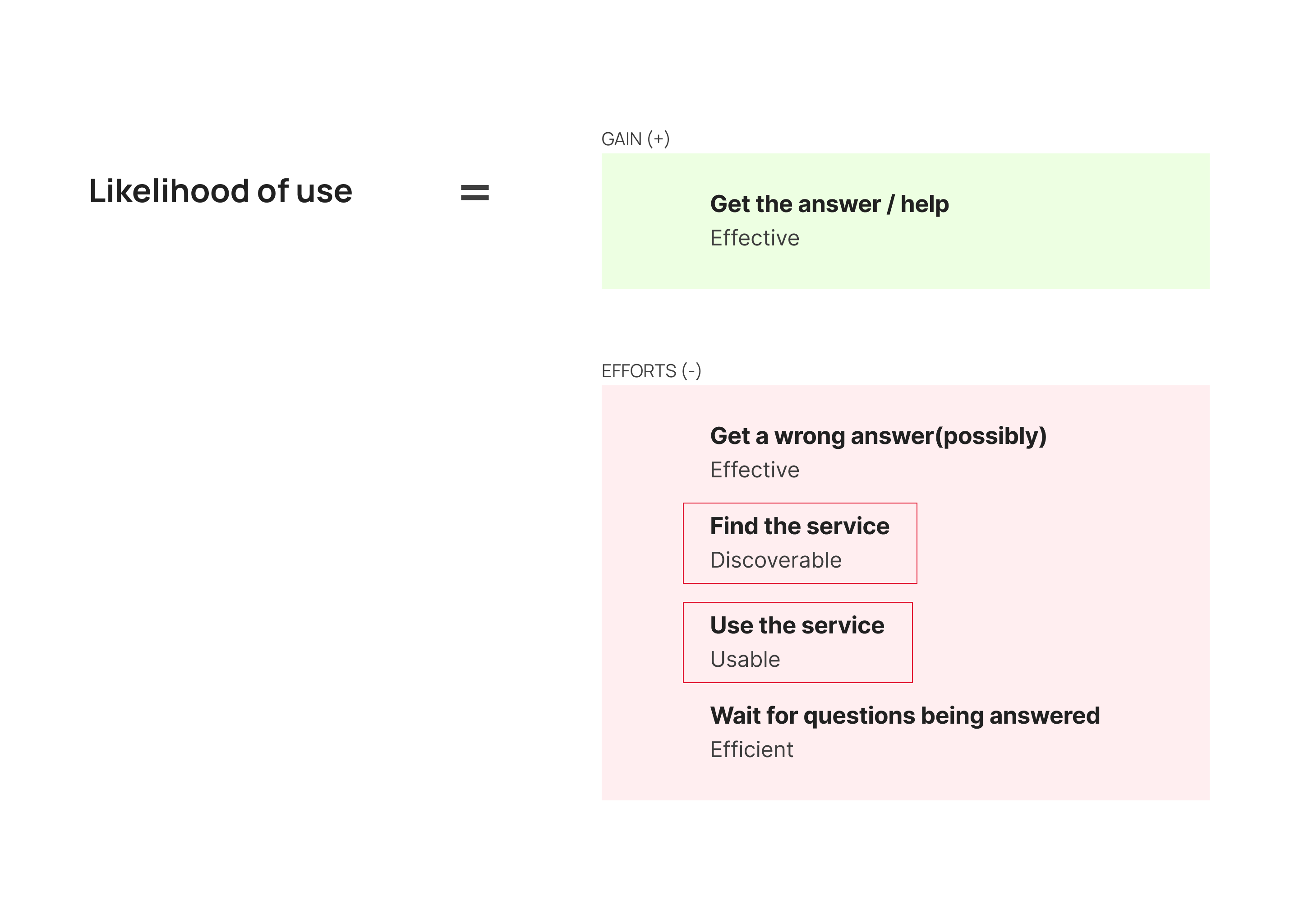
A table breaking down the value equation into Gain and Effort, with specific factors and lenses for each

Of these four lenses, Effective and Efficient are properties of the librarians and the conversation itself — outside the medium. Discoverable and Usable are properties of the interface, so that's where the redesign focused:

  • Find the service → increase discoverability
  • Use the service → make it more usable

Design

Each change below is anchored to a Nielsen heuristic and tagged with which side of the equation it addresses.

Consistency & Standards (Discoverable)

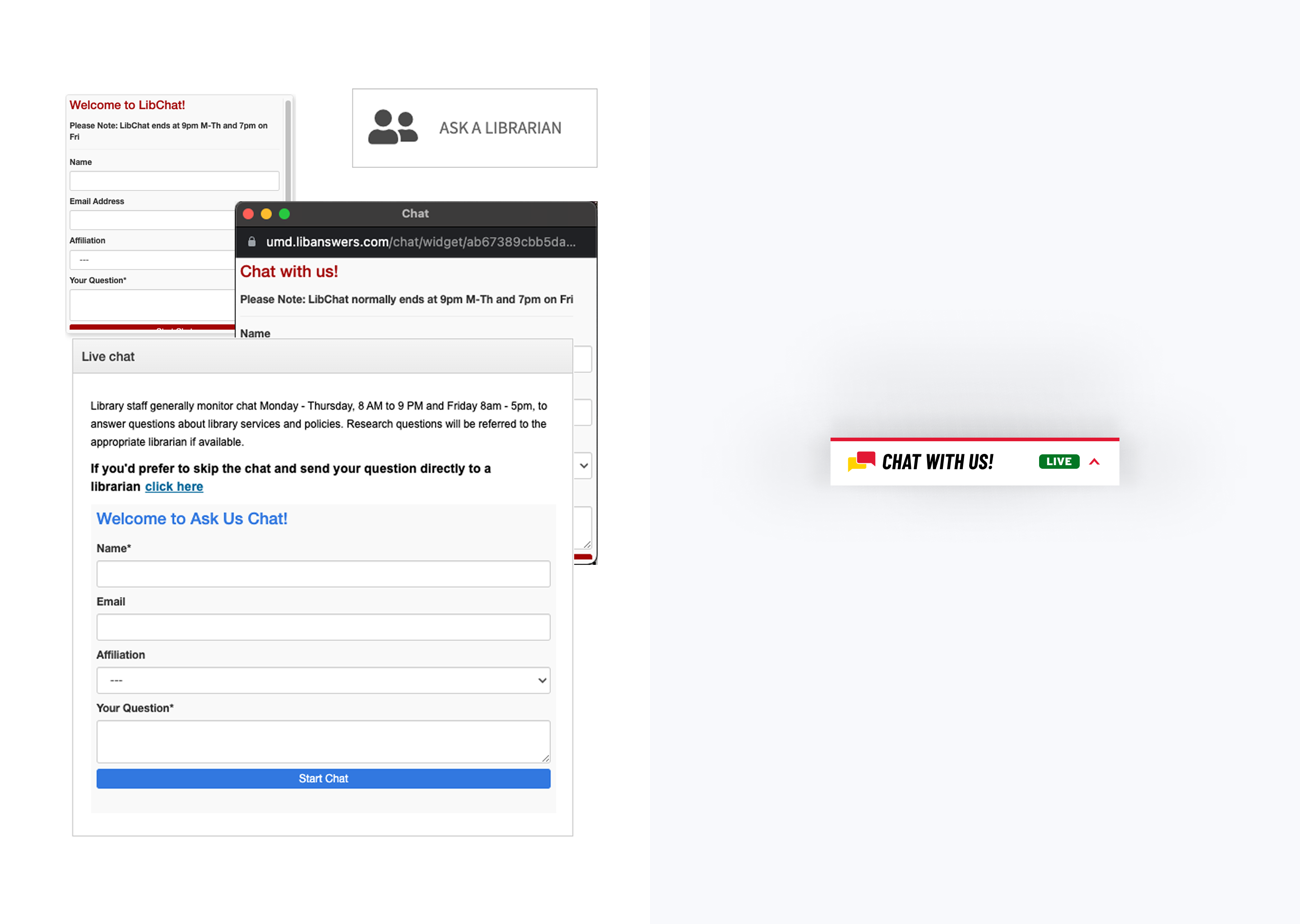
Left — original site with multiple inconsistent names for the chat service across pages; right — standardized 'Chat With Us!' branding applied everywhere

The service appeared under several different names across the website. Consolidating on a single name — "Chat With Us!" — gave users one recognizable label to look for, regardless of where they landed.

Visibility of System Status (Discoverable)

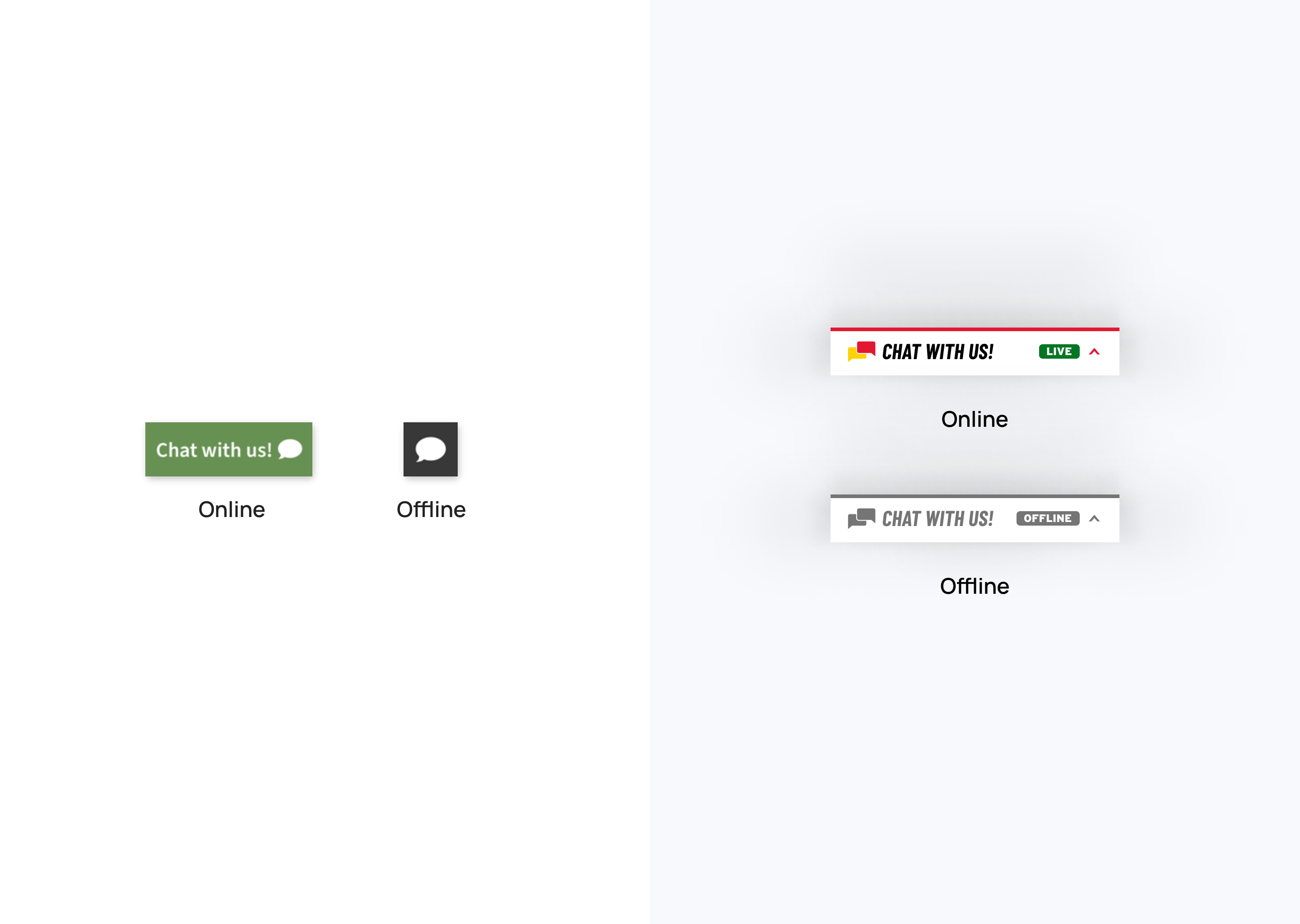
Left — original chat box with no status indication; right — new design clearly showing live or offline state

The chat box now clearly indicates whether the service is live or offline, so users know upfront whether starting a chat is worth their effort.

Recognition rather than Recall (Discoverable + Usable)

This heuristic spans both sides of the equation, so it drives two changes.

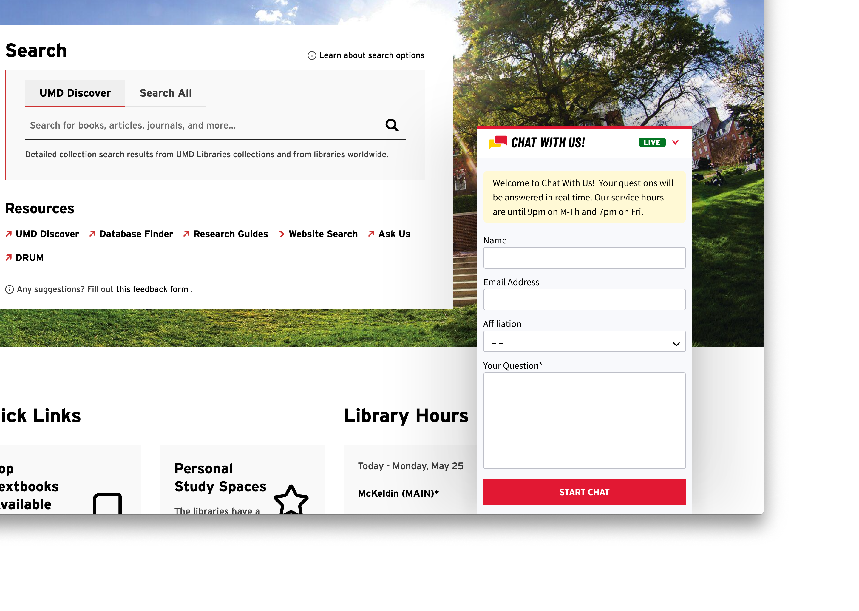
Discoverable — aligned the widget with conventions users already know from chat services like Facebook Messenger: anchored at the bottom-right corner of the screen, consistent across pages.
New design consistently anchored at the bottom-right corner of the screen

Usable — standardized the widget so that every element a user needs is visible the moment it opens, rather than hidden behind extra clicks or exploration.
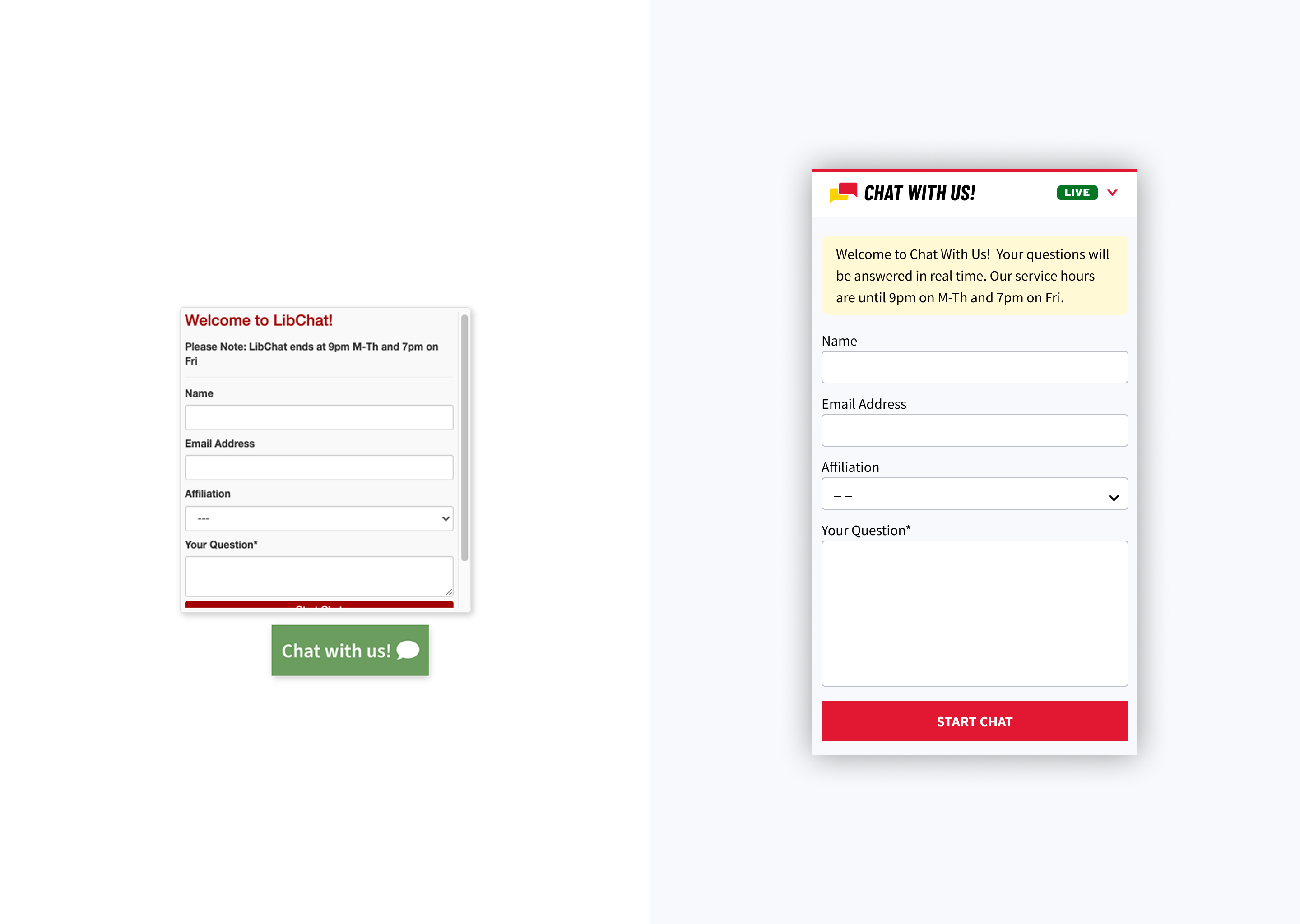
Left — original design with hidden CTA button; Right — new design showing all necessary elements visible immediately when the widget opens, rather than hidden behind extra clicks

Error Prevention (Usable)

Added consistent, contextual guidance to head off mistakes:

  • A persistent notice at the top of the chat warning users not to close the tab and lose their conversation.
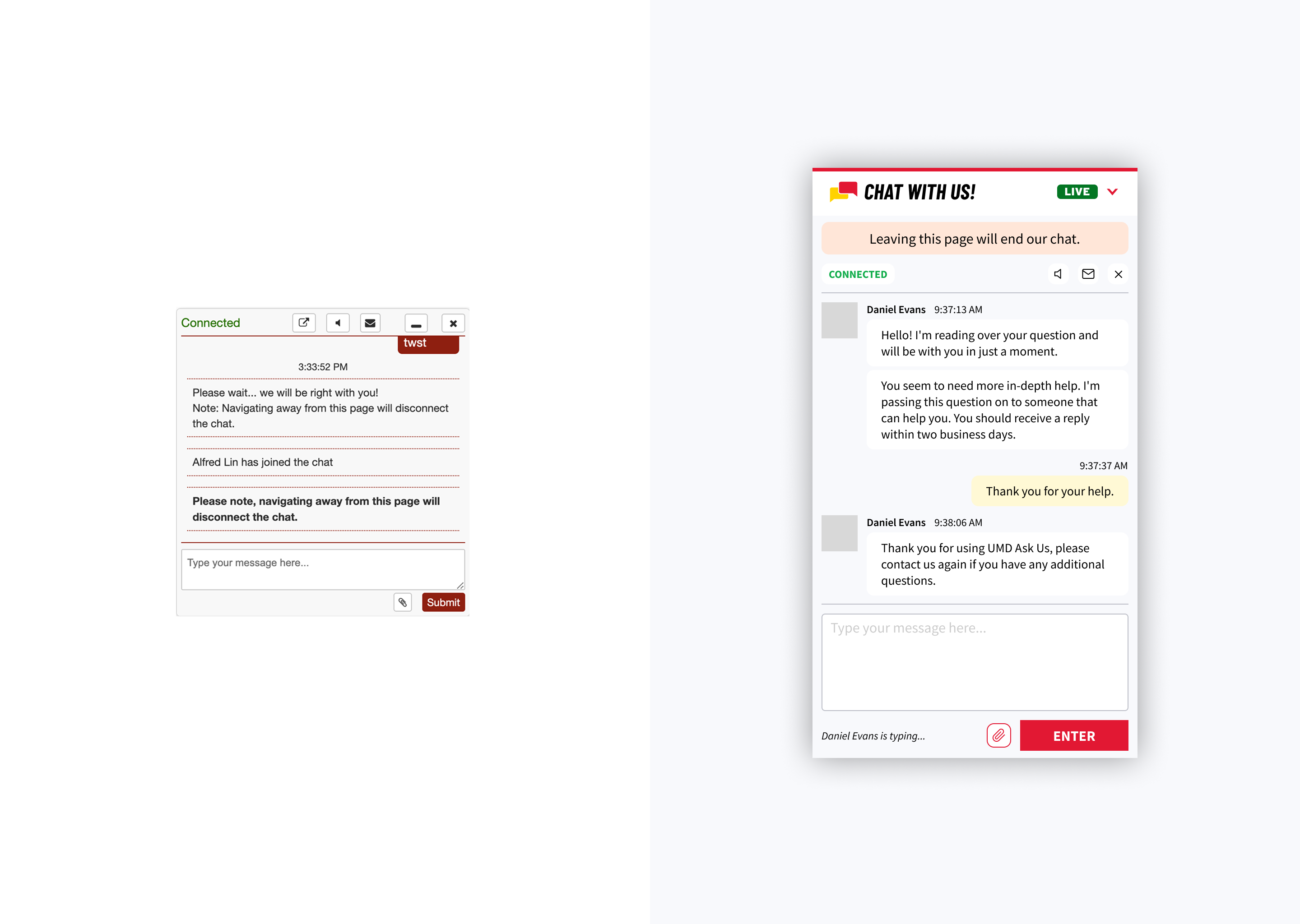
Left — original design; Right — new design with persistent notice at the top warning users not to close the tab and lose their conversation
  • Clear instructions on the file-upload page so users know what formats and sizes to expect, replacing inconsistent upload limits with a single set of consistent guidelines.
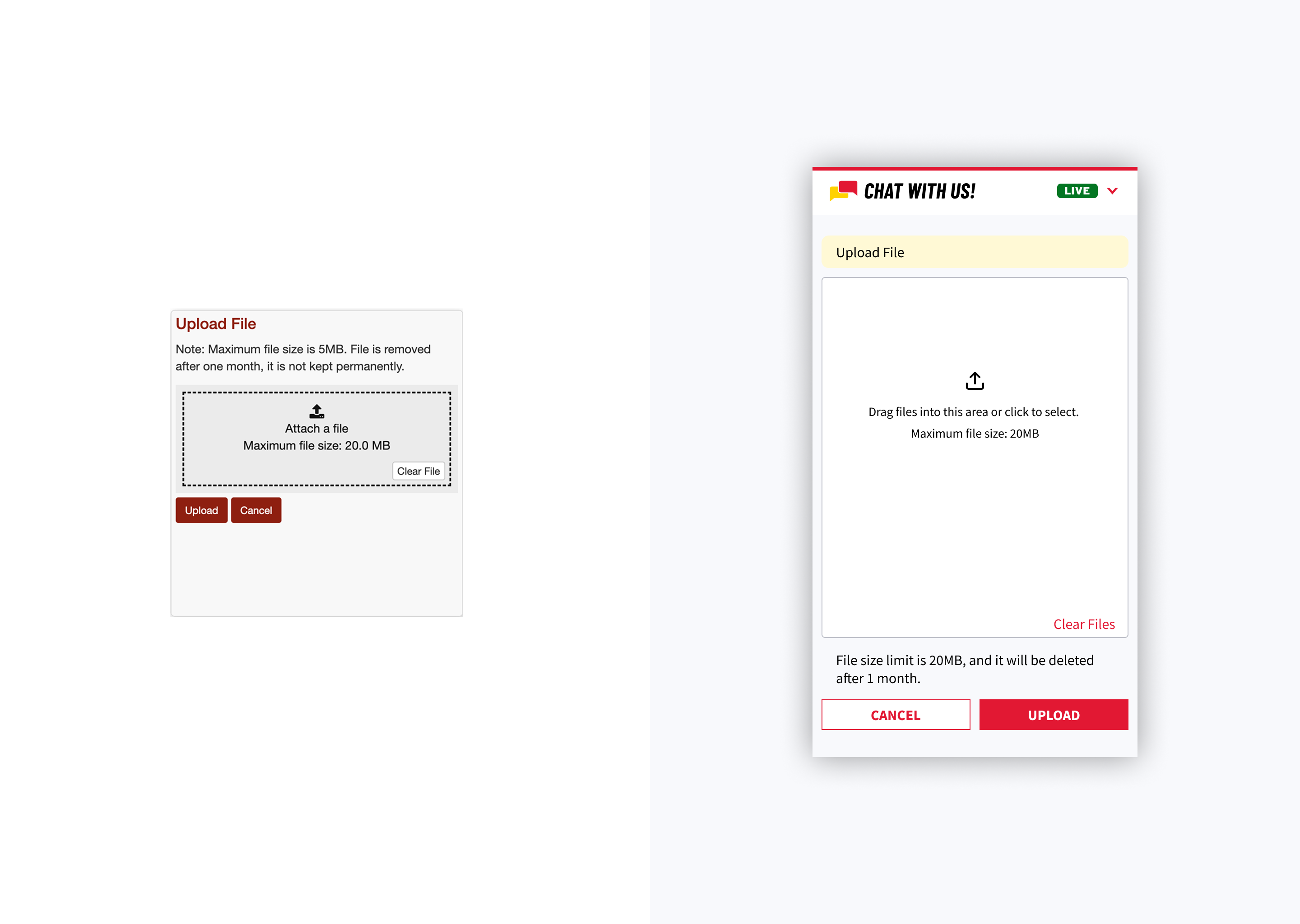
Left — original file upload page with contradictory instructions; Right — new design with clear instructions on accepted formats and sizes

Help & Documentation (Usable)

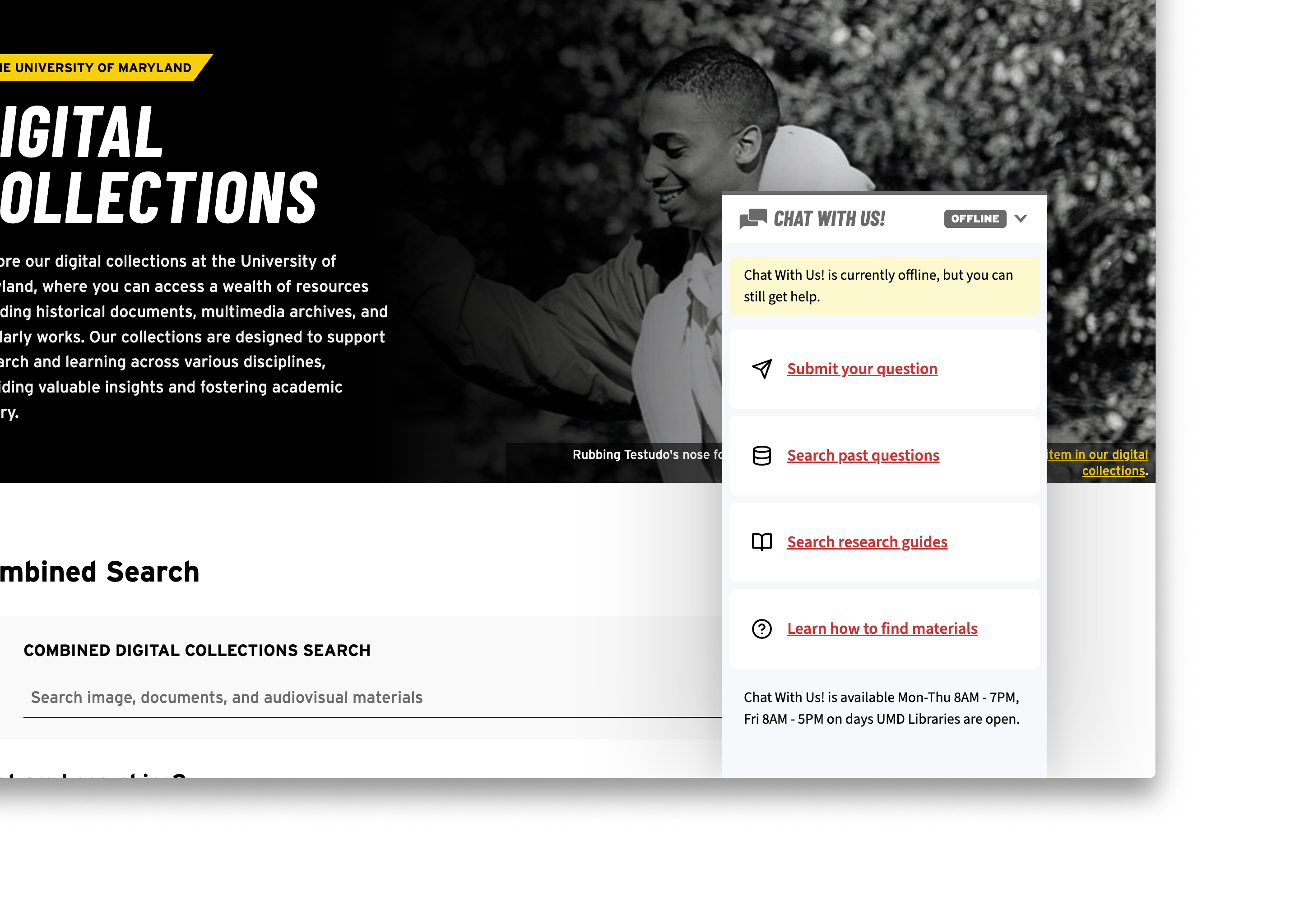
When the service is offline, the widget now surfaces quick links to the most common alternative resources, alongside the schedule of upcoming live hours. The layout was redesigned to be scannable, so users can see at a glance what help is still available.
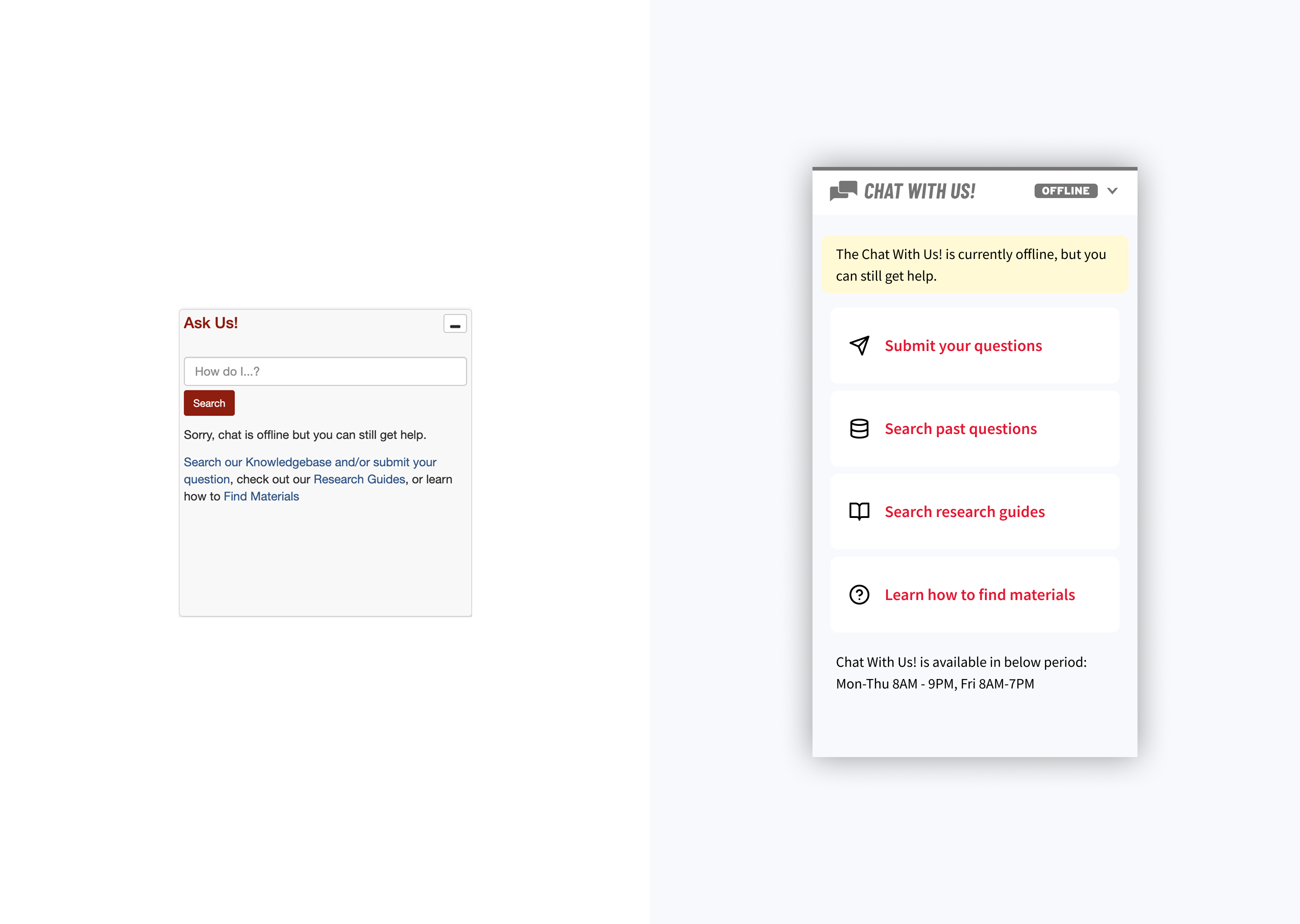
Left — original offline state; Right — new design showing quick links to alternative resources and schedule of upcoming live hours in a scannable layout

Impact

After the redesign launched, chat usage grew ~30% year-over-year.

Because the widget is embedded across every UMD Libraries digital property, the redesigned experience reaches users at every entry point into the library system — so the gain compounds across surfaces rather than being isolated to a single page.

Reflection

In product design there's often a lot you can't control — the quality of the service being delivered, or whether users feel motivated to engage with it. The work is to identify what parts of the system you can influence and pick the highest-leverage points. The value equation made the medium itself the obvious lever, and Nielsen's heuristics translated that lever into specific moves.

The same framing also points to where the next round of work lives: Effective and Efficient — the conversation itself. Surfacing expected response time during the wait, or pairing the widget with lightweight post-chat feedback, would let the same equation drive improvements on the service side, not just the medium.
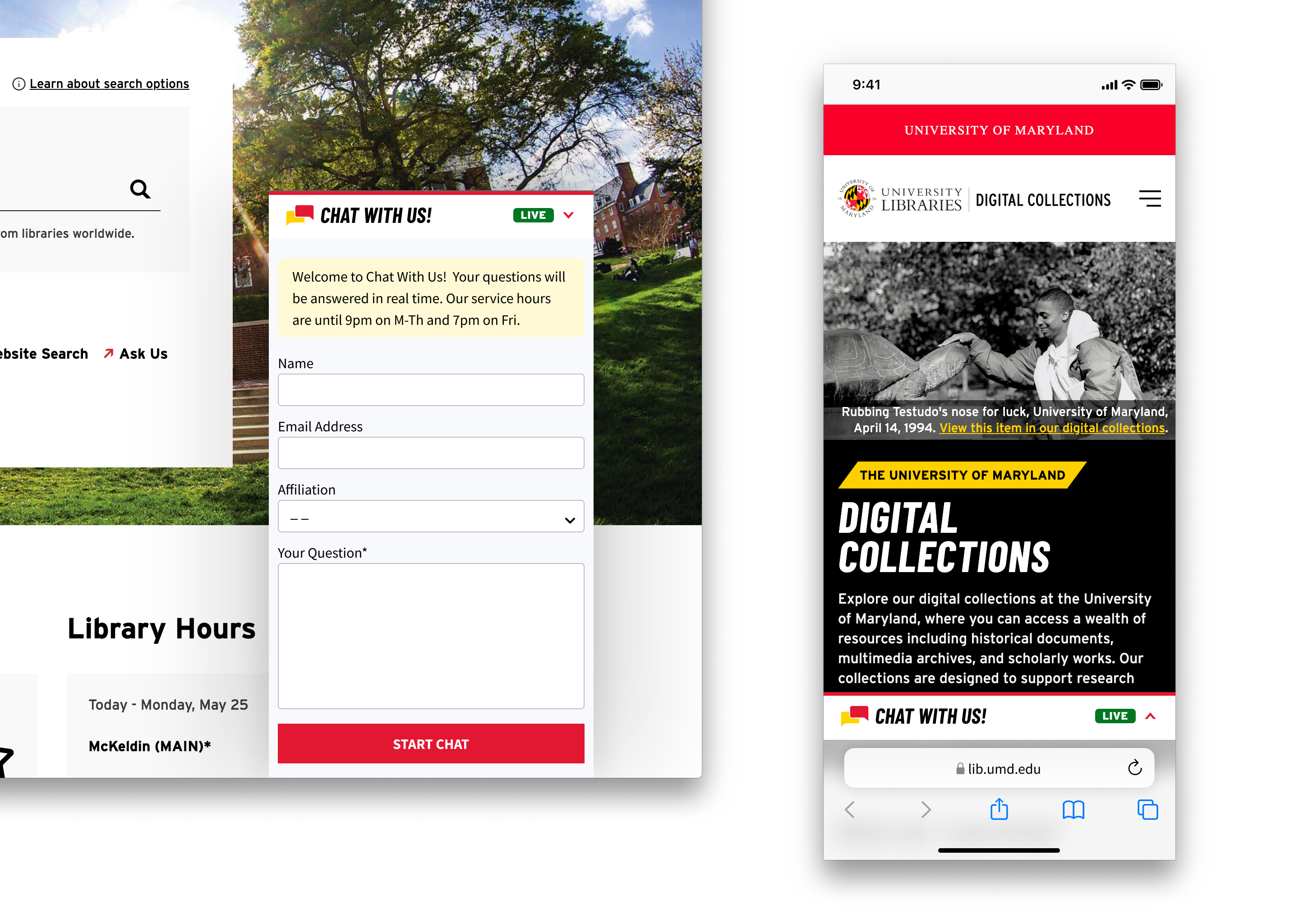
Left — chat widget on the desktop website; Right — chat widget on the mobile website