
The Problem
The existing library entrance display showed only two things: computer availability counts and a link to a list of borrowable equipment. The data had been broken for an extended period, making the display functionally useless; and even when working, it answered questions students weren't really asking.
The deeper issue wasn't the broken data. It was that the display was designed around what the system could output, not what students actually need when they walk through the door.
Students entering a library have a short, predictable set of questions: Can I stay? Where can I work? What's available to me? Where do I go for help? The old display addressed almost none of these.
Research & Prioritization
Staff interviews and website analytics converged on the same four categories: hours, spaces, equipment, and wayfinding. Analytics confirmed it — nearly 20% of location-page traffic goes directly to space availability. This became the urgency order:
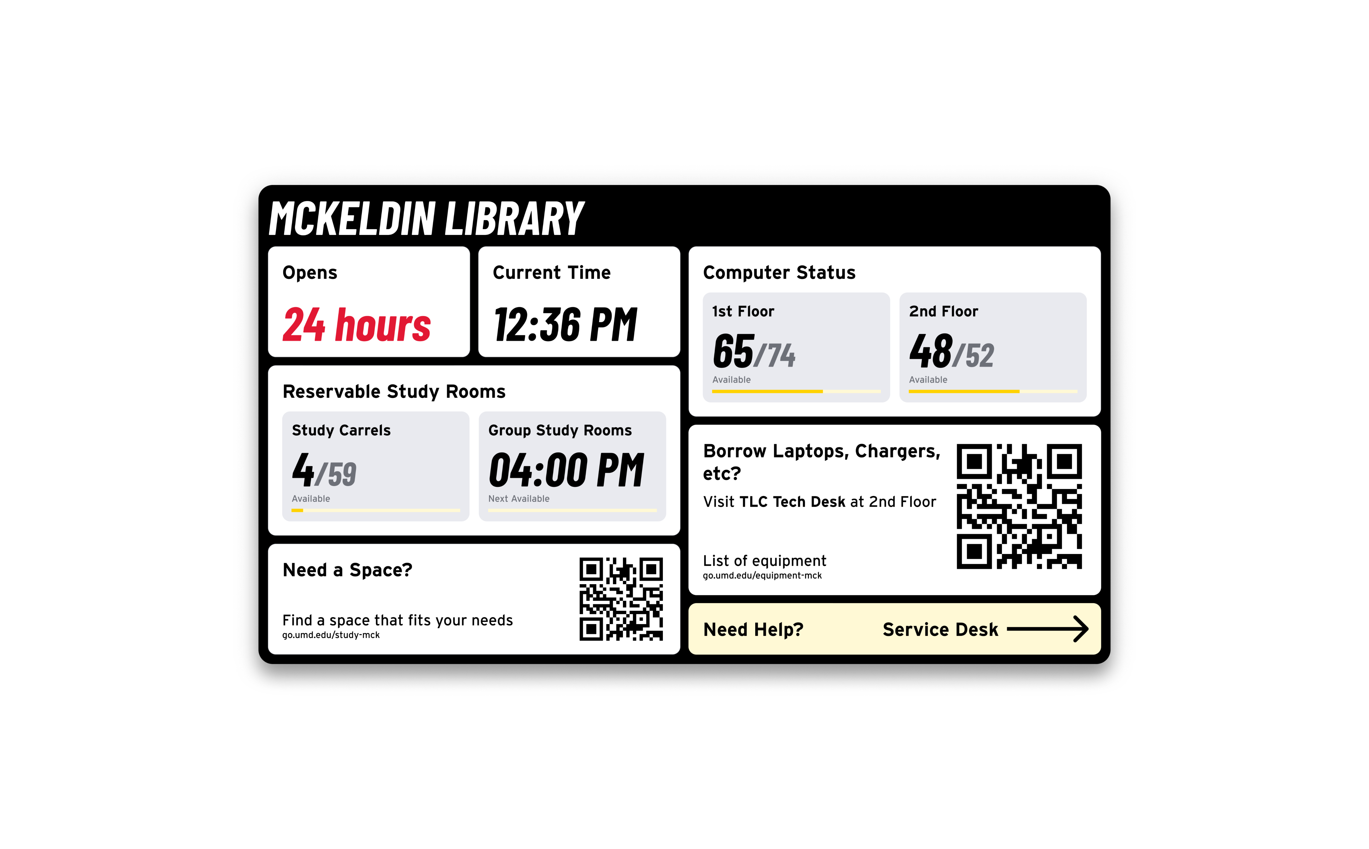
- "Can I stay?" — Closing time and current time
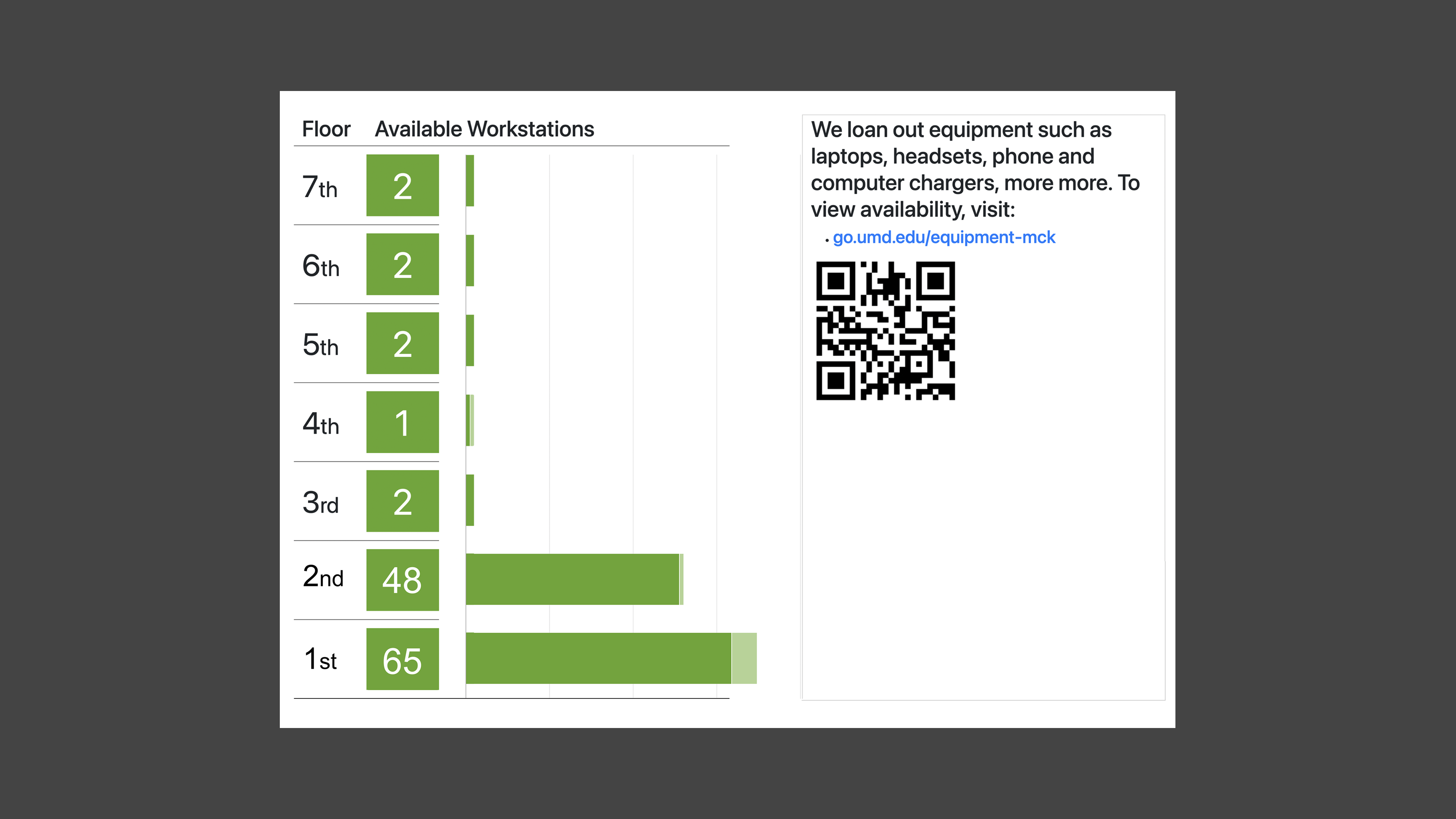
- "Where can I work?" — Study room and computer availability
- "What resources are available?" — Equipment, tech lending, services
- "Where do I go?" — Wayfinding to service desks and deeper information
Design Decisions
1. Information Hierarchy for a Passive Display
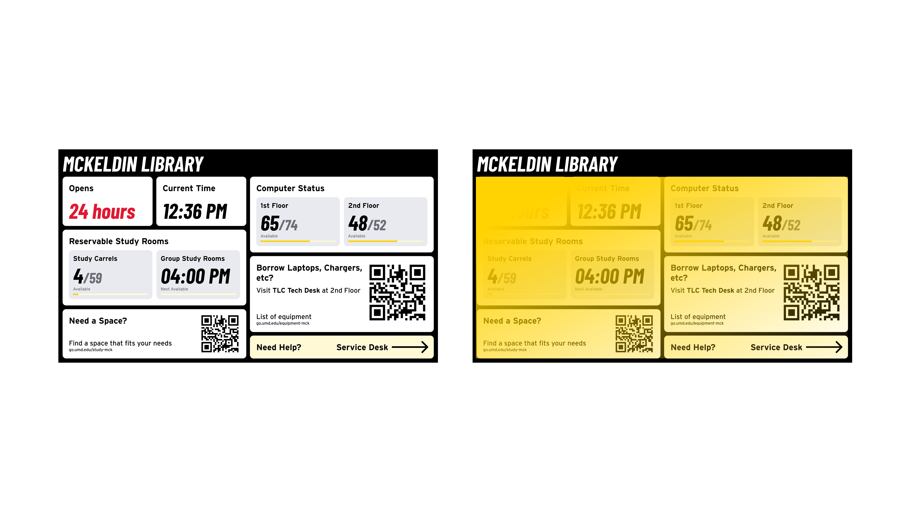
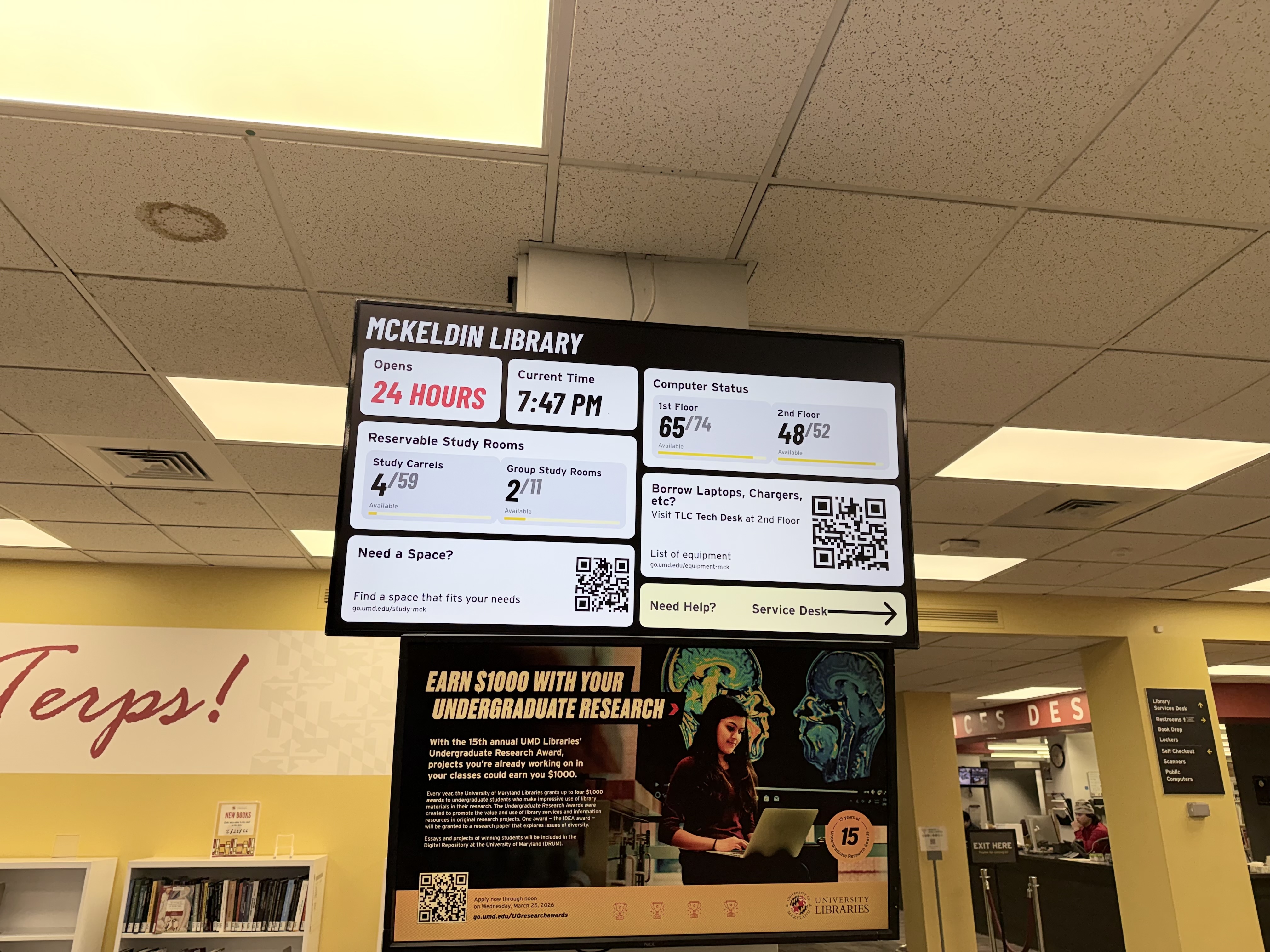
Unlike a website, users can't scroll or search — everything competes for attention at once on a single screen viewed from a distance. Time-critical info sits top-left in the largest type; availability occupies the middle; QR codes and wayfinding anchor the bottom for students who've decided to stay.
2. Designing for Physical Constraints
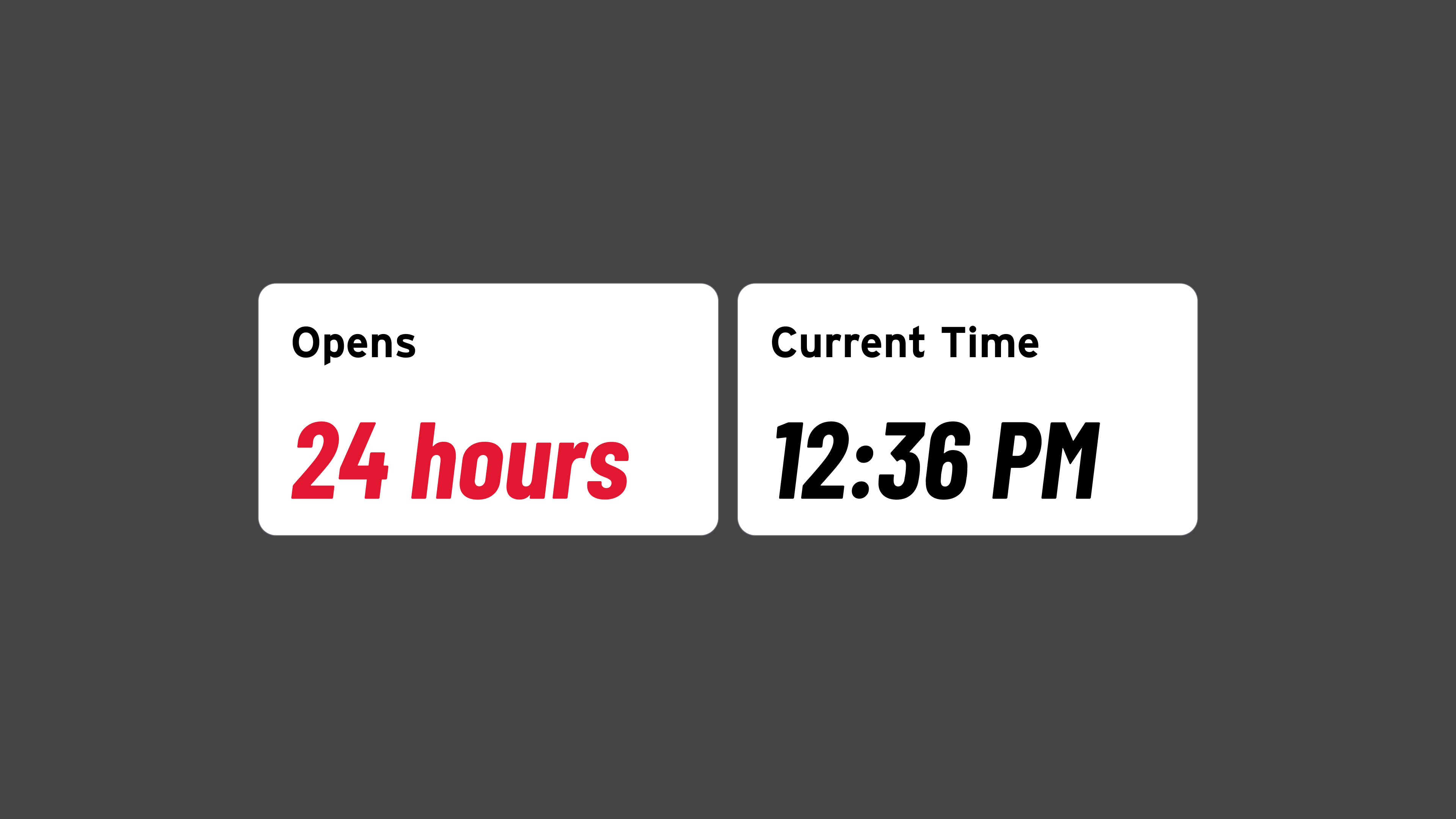
This is a large-format screen viewed from 10–15 feet in variable lighting — not a laptop. Critical numbers are large and bold; closing time displays in red so a student can register urgency before reading the digits; the dark background holds contrast under overhead fluorescents and shifting daylight.
3. Physical-to-Digital Handoff
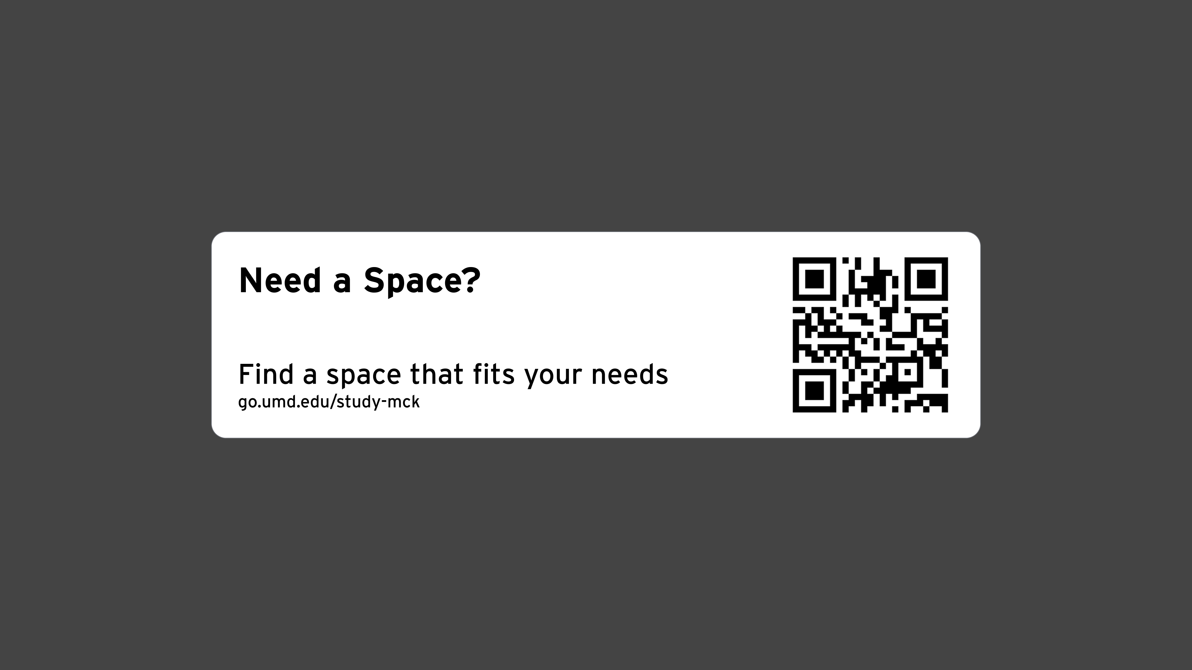
Some information — full equipment lists, room reservation flows — is too detailed for a passive screen. QR codes hand off to the student's phone: the display surfaces awareness, the phone enables action.
4. Location-Specific Content Modules
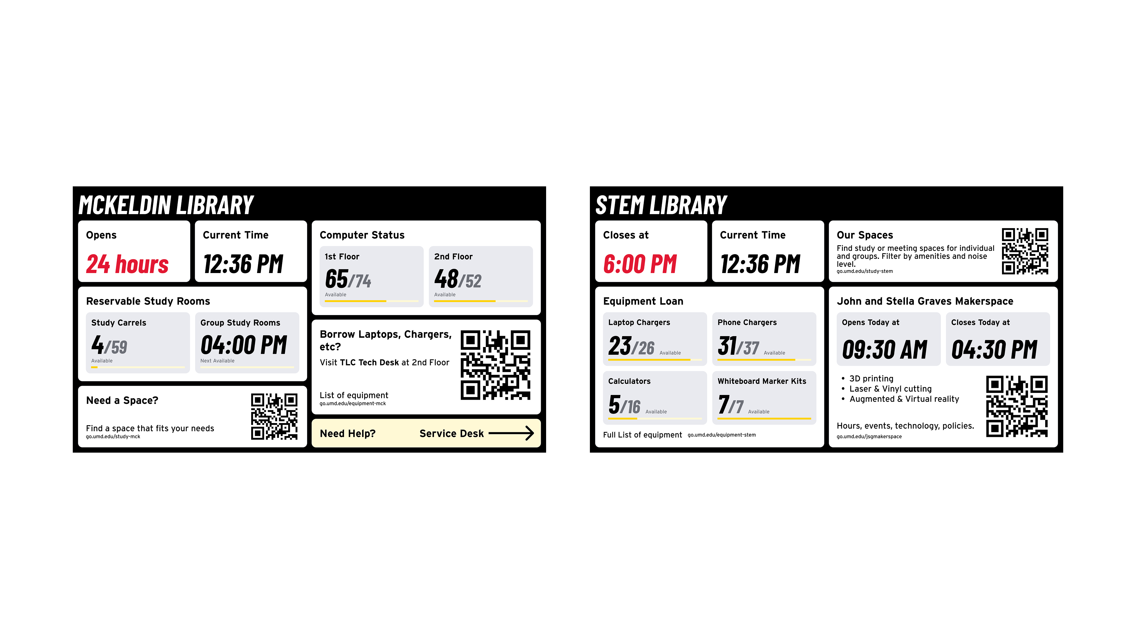
Each library serves a different population, so content blocks swap per location — McKeldin leads with study room availability; other branches foreground equipment or specialized services. The hierarchy stays consistent; only the modules change.
The Design
A grid of content cards on a dark background, each addressing one category of information. I designed and implemented the frontend — Figma through production code — with real-time data feeds for room and computer availability requiring no manual updates.
Interested in the implementation details? Check out the open-source GitHub repositories.
GitHub Repository
UMD Library Monitors
Outcome
The redesigned dashboard replaced a broken, single-purpose display with a comprehensive information system now deployed across multiple UMD library locations. Each location surfaces the information most relevant to its visitors while maintaining a consistent framework and visual language.
What changed:
- Went from showing only computer counts (that weren't working) to a full information system covering hours, spaces, equipment, and wayfinding
- Real-time data feeds ensure information stays accurate without staff intervention
- QR codes bridge the gap between ambient awareness and actionable detail on students' personal devices
- Modular design supports location-specific content across the library system
Reflection
Designing for a passive display with no interactivity and no analytics meant I couldn't validate decisions the usual way — no clicks, no scroll depth, no scan data. If I revisited this, I'd track QR scan rates by location as a lightweight feedback loop, and observe students at entrances to confirm the information hierarchy matches actual glance patterns.
The project reinforced something I've come to value: the most impactful decisions are often about what to leave out. The old display showed everything the system had. The new one asks a simpler question — what does someone walking through this door need to know right now?