Problem — The Search Experience Gap
User research revealed that only 22% of users find what they are looking for when visiting the libraries' websites.
The libraries' website is where users begin their research, and the homepage search box shapes that entire journey. But the UMD Libraries' resources each live behind a separate search tool, and navigating between them often leaves users frustrated and unable to find what they came for.
I owned this project end-to-end — from user research and synthesis through interaction design, prototyping, and frontend implementation of the new search interface.
Research
How might we simplify the search experience to help users find and access the exact resources they need quickly and confidently?
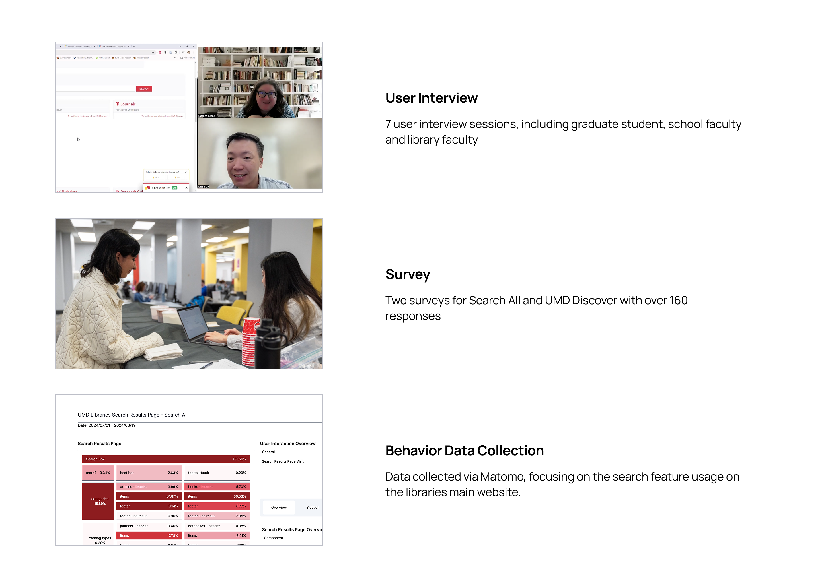
I wanted to understand users — how they do research, how they interact with search tools, and how they access materials. To capture a representative range of needs and behaviors, I recruited students, faculty, and staff across multiple disciplines.
I triangulated three methods to surface pain points: user interviews for depth, surveys for breadth, and web analytics for behavioral signal at scale.
Key Findings
One number cut through everything else and became the spine of the redesign:
Over 90% of search interactions happened with results from the catalog — yet the catalog wasn't the default search tool on the homepage.
The two pain points users surfaced were symptoms of the same root cause: the system was organized around how the libraries are structured internally, not around how people actually search.
Building the Case
Acting on these findings meant changing the default search — and that wasn't an interface decision, it was a political one. "Search All" wasn't just a long-standing default; it mirrored how the libraries understood their own holdings, and demoting it meant asking administration to overrule an arrangement the institution had built its homepage around.
Data alone doesn't win that argument. I made the case in a formal research report that walked through the behavioral evidence, the user pain points, and the operational implications of the switch — and framed the change deliberately: not as removing Search All, but as no longer making every visitor start there. The recommendation was approved, and the default changed.
Research Report
Search Experience Research & Recommendation
Solution
The redesign came down to three changes — but they weren't equal in impact. Switching the homepage default to the catalog did most of the work; expanding catalog scope and adding inline guidance reduced the friction users still encountered after that first click.
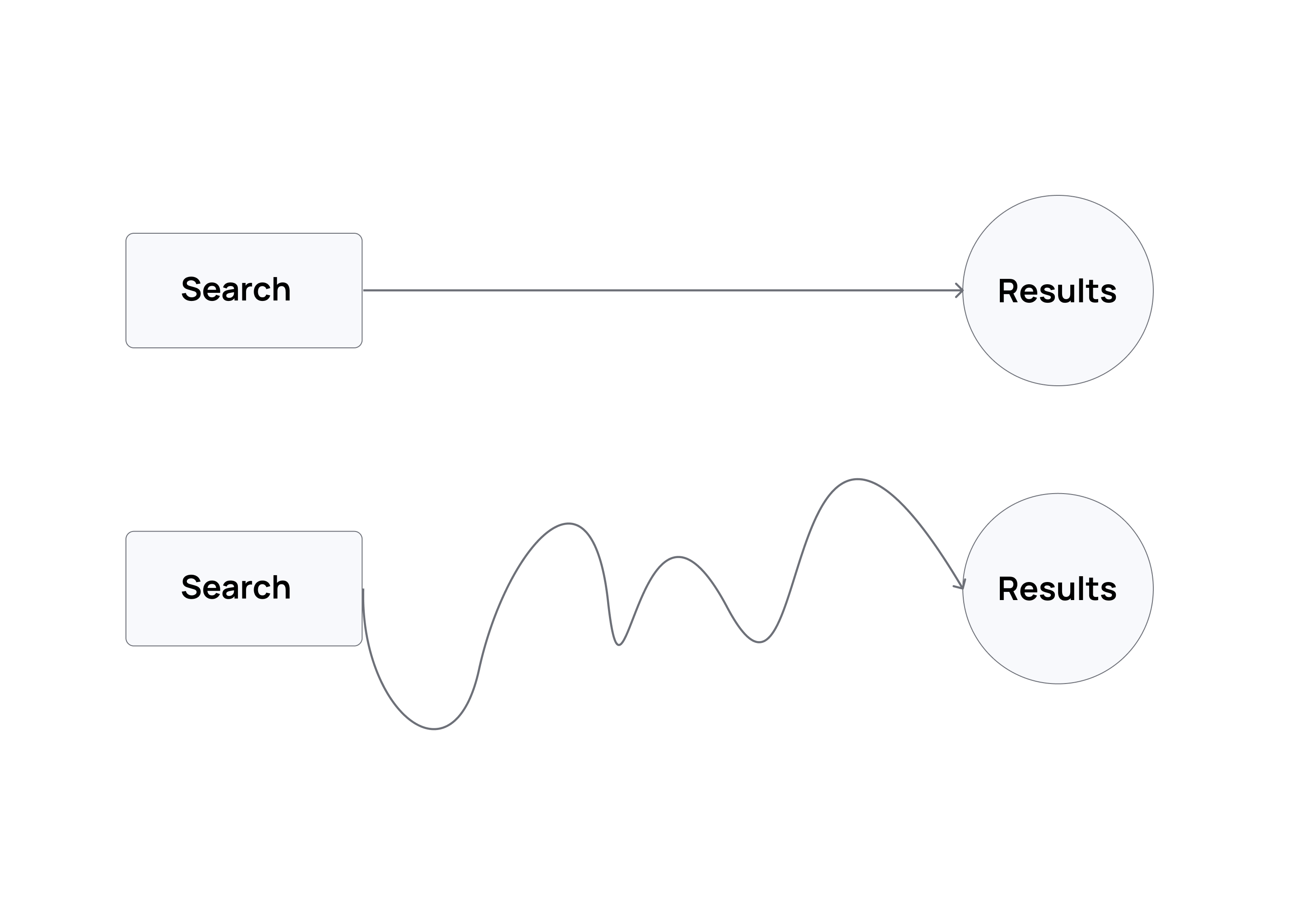
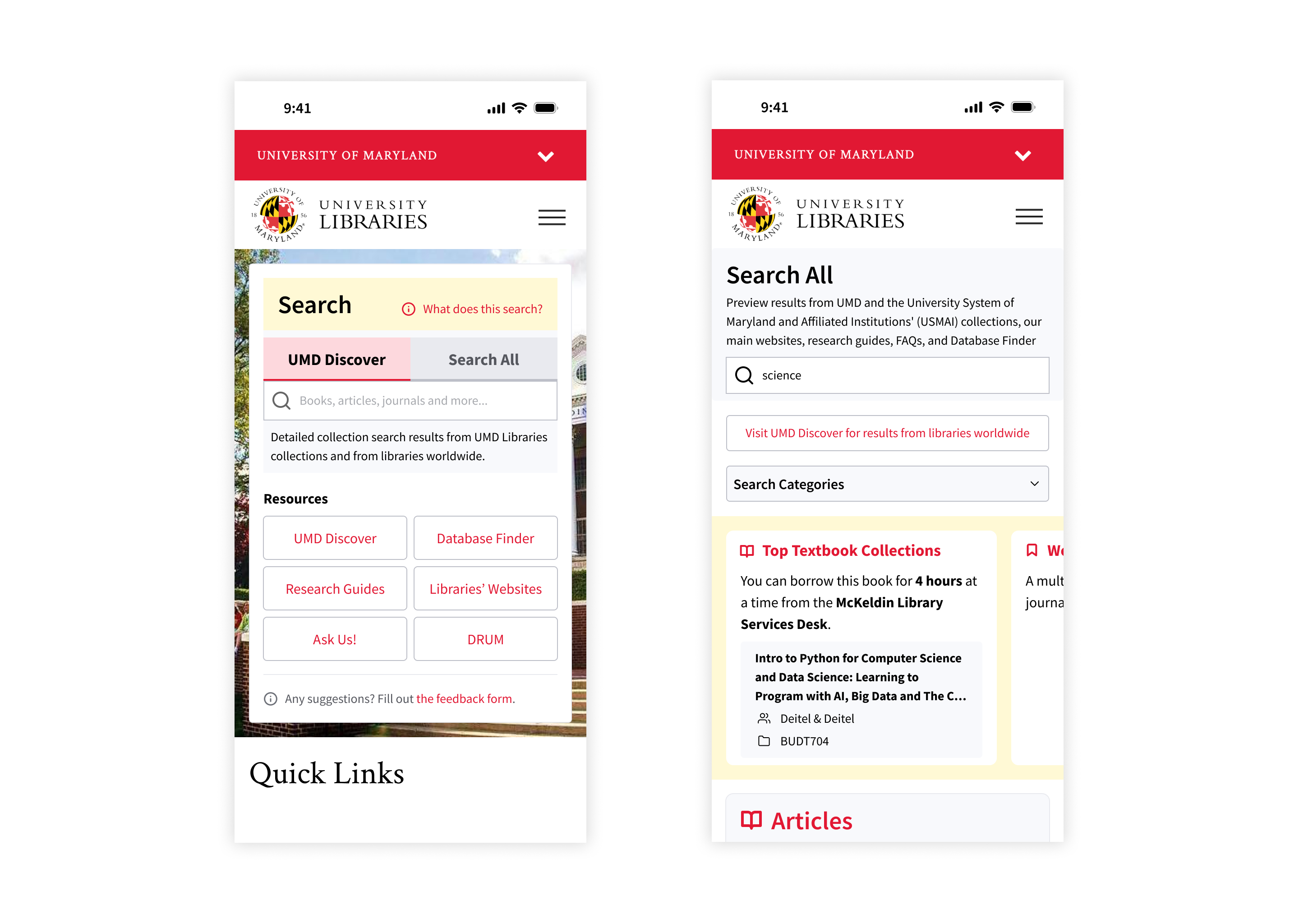
1. Simplify the path to information
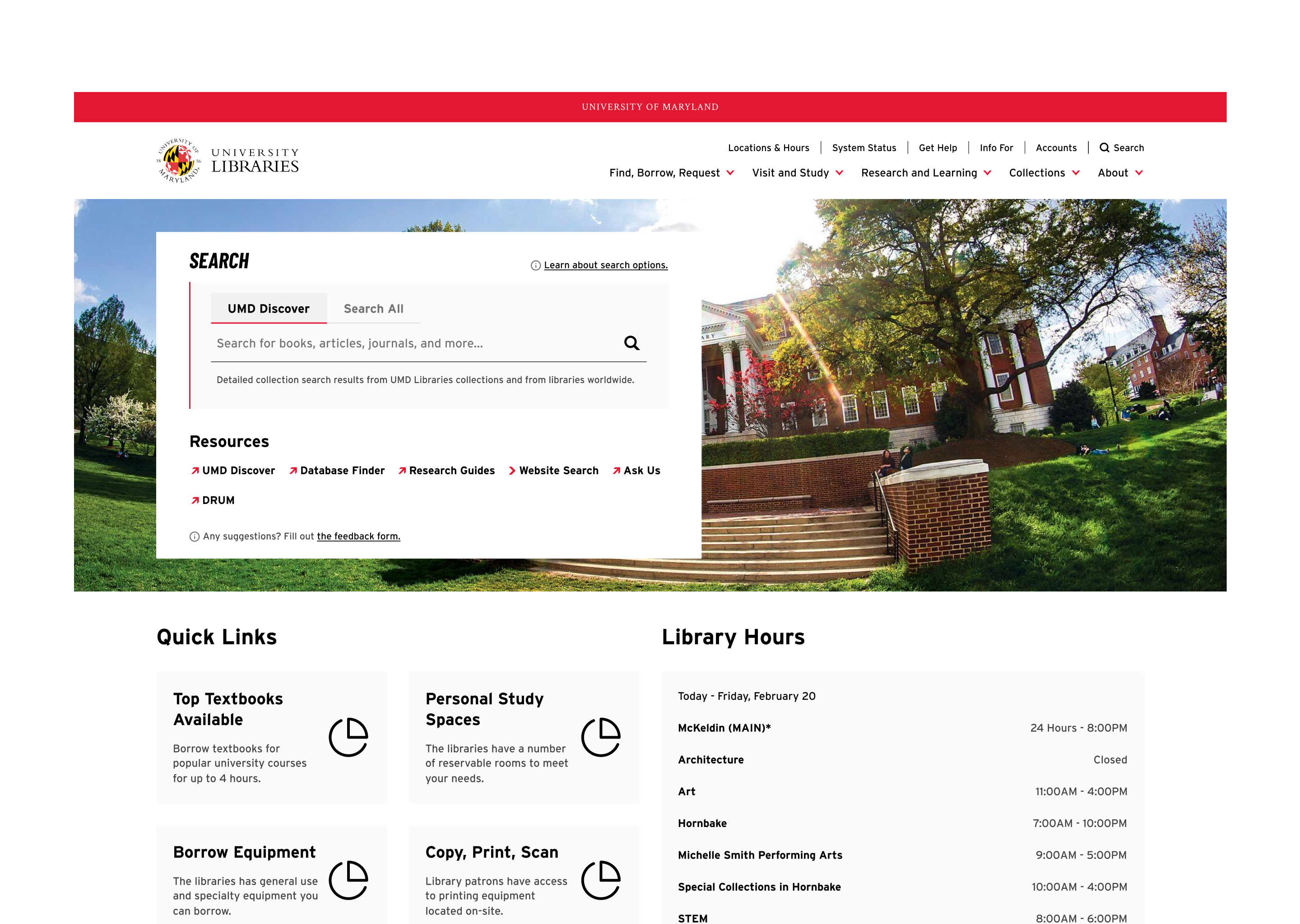
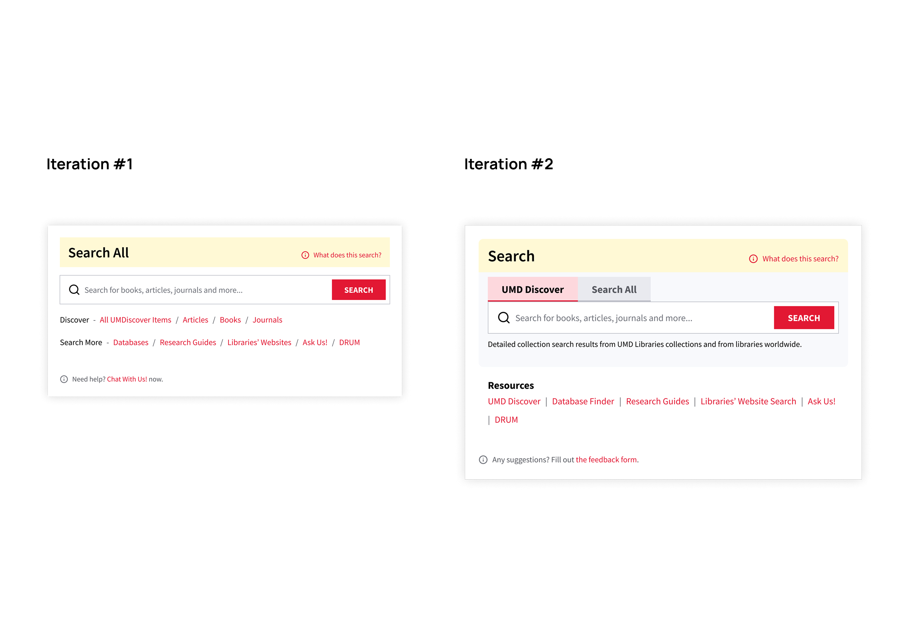
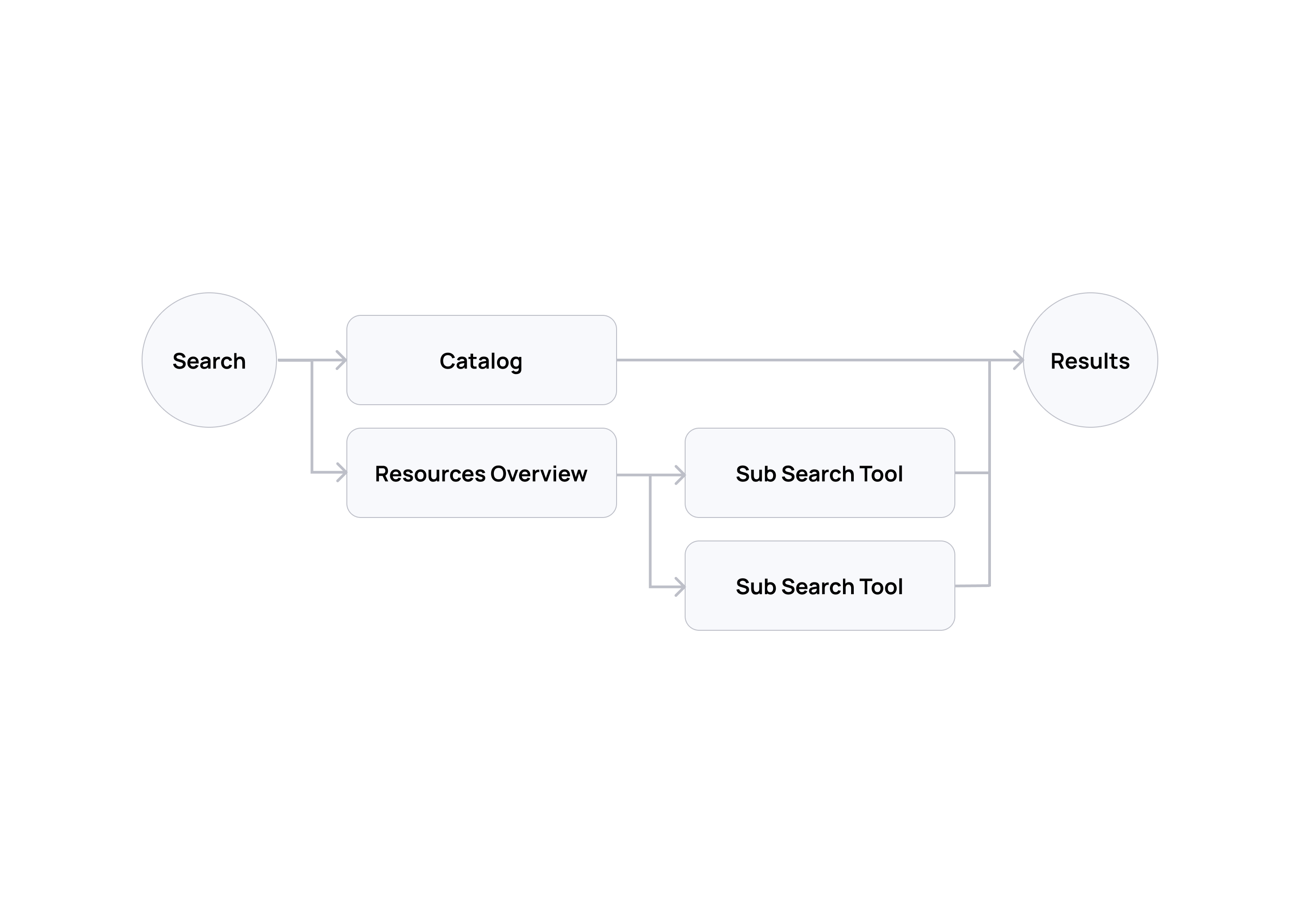
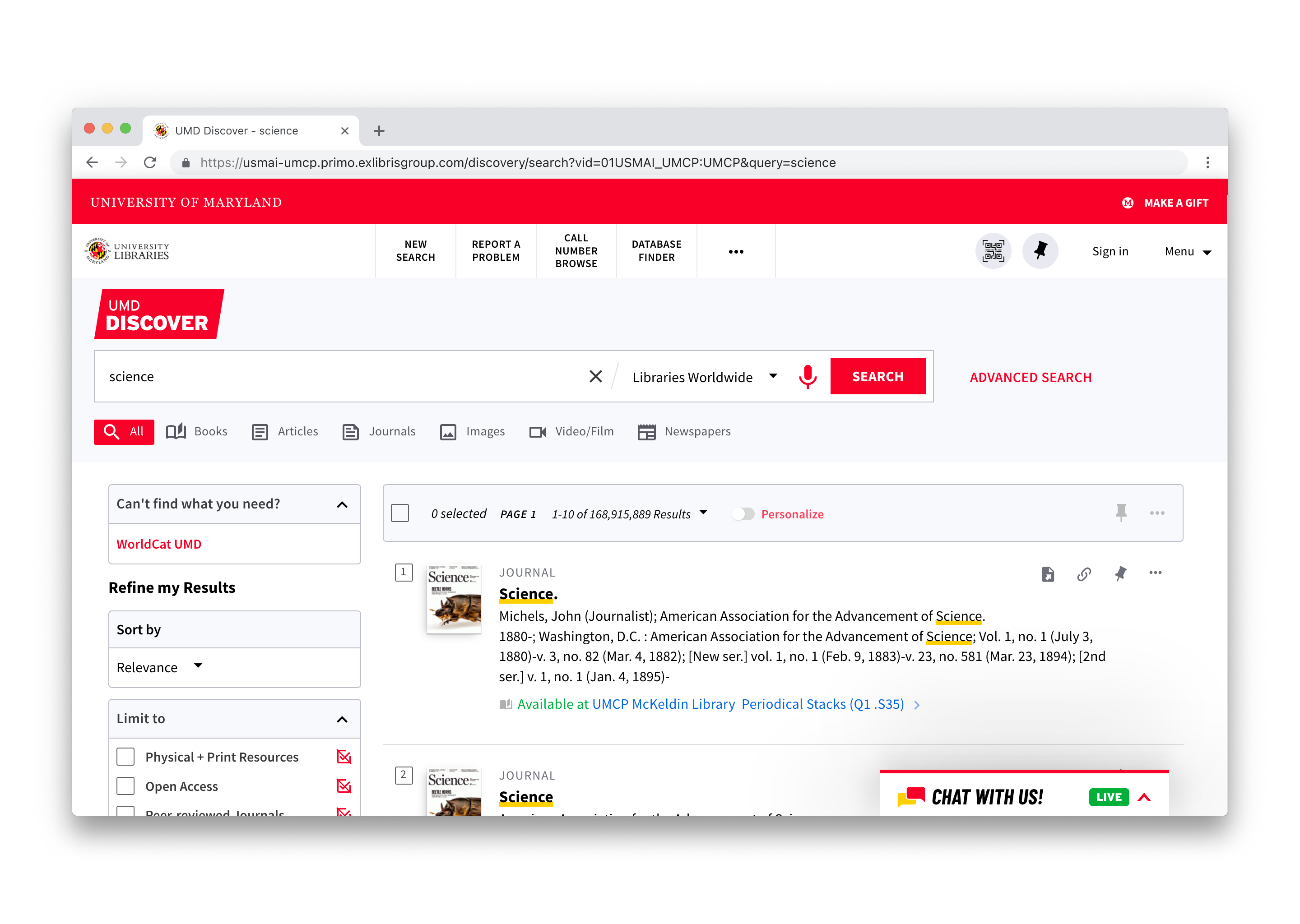
The highest-leverage change was the smallest: I added the catalog search (UMD Discover) to the homepage search box and replaced the resource overview search (Search All) as the default. This shifted the user journey from an overview-first flow to a direct catalog-first flow, aligned with the 90% behavioral signal from research. Search All stayed — the point was never to remove the overview tool that librarians and experienced researchers valued, but to stop making it the mandatory first step for everyone else.
See how the user journey changed:
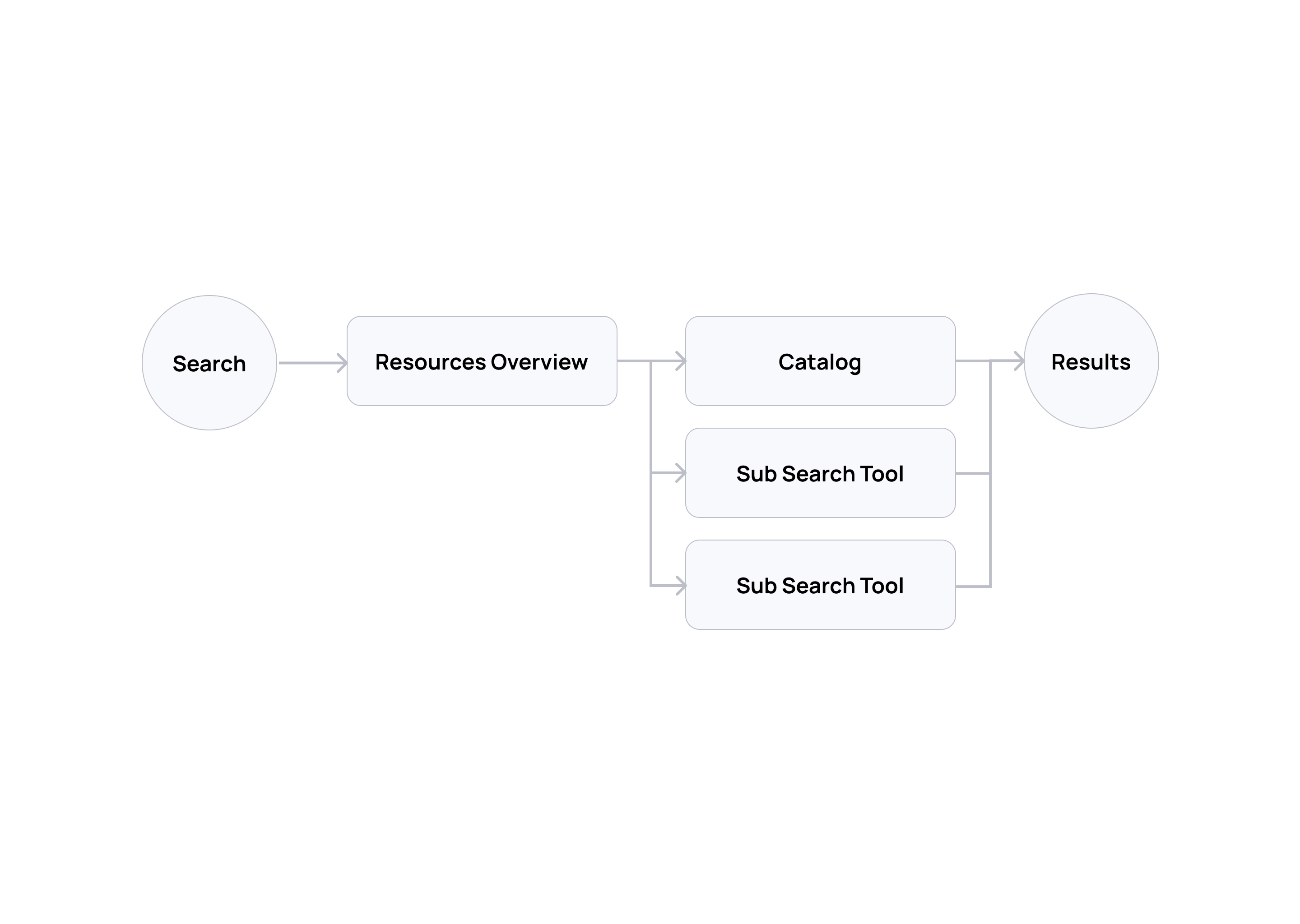
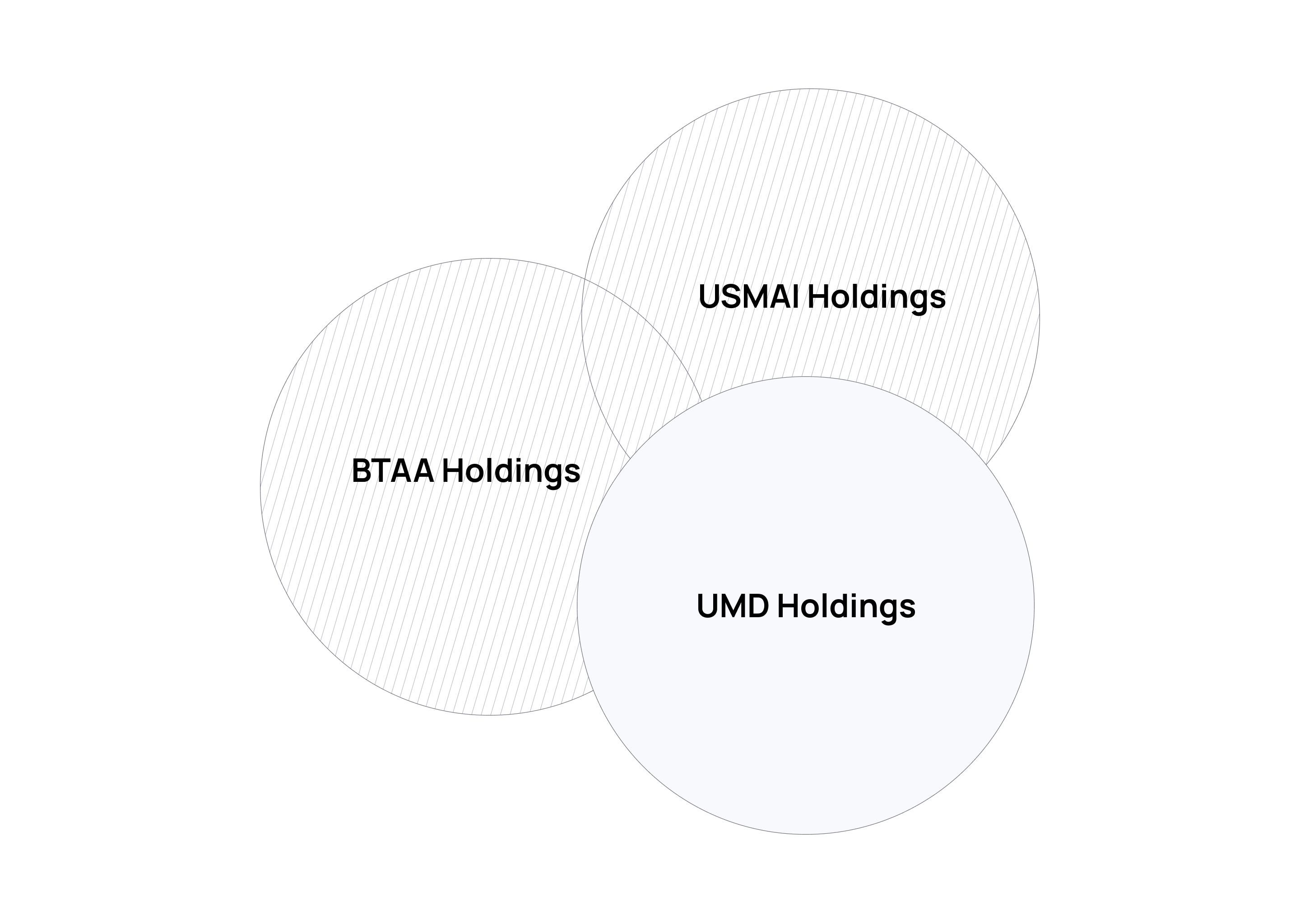
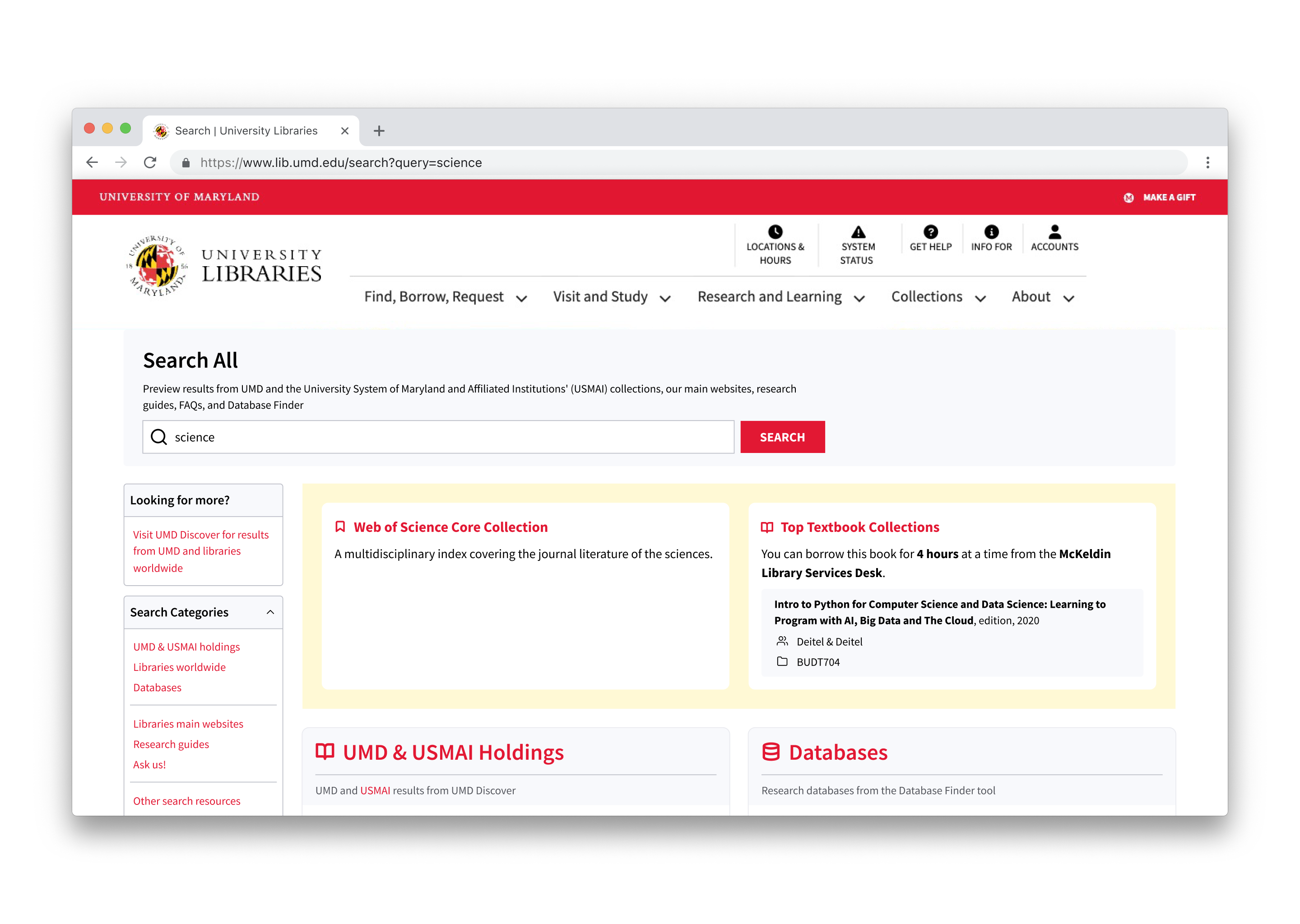
2. Update scope
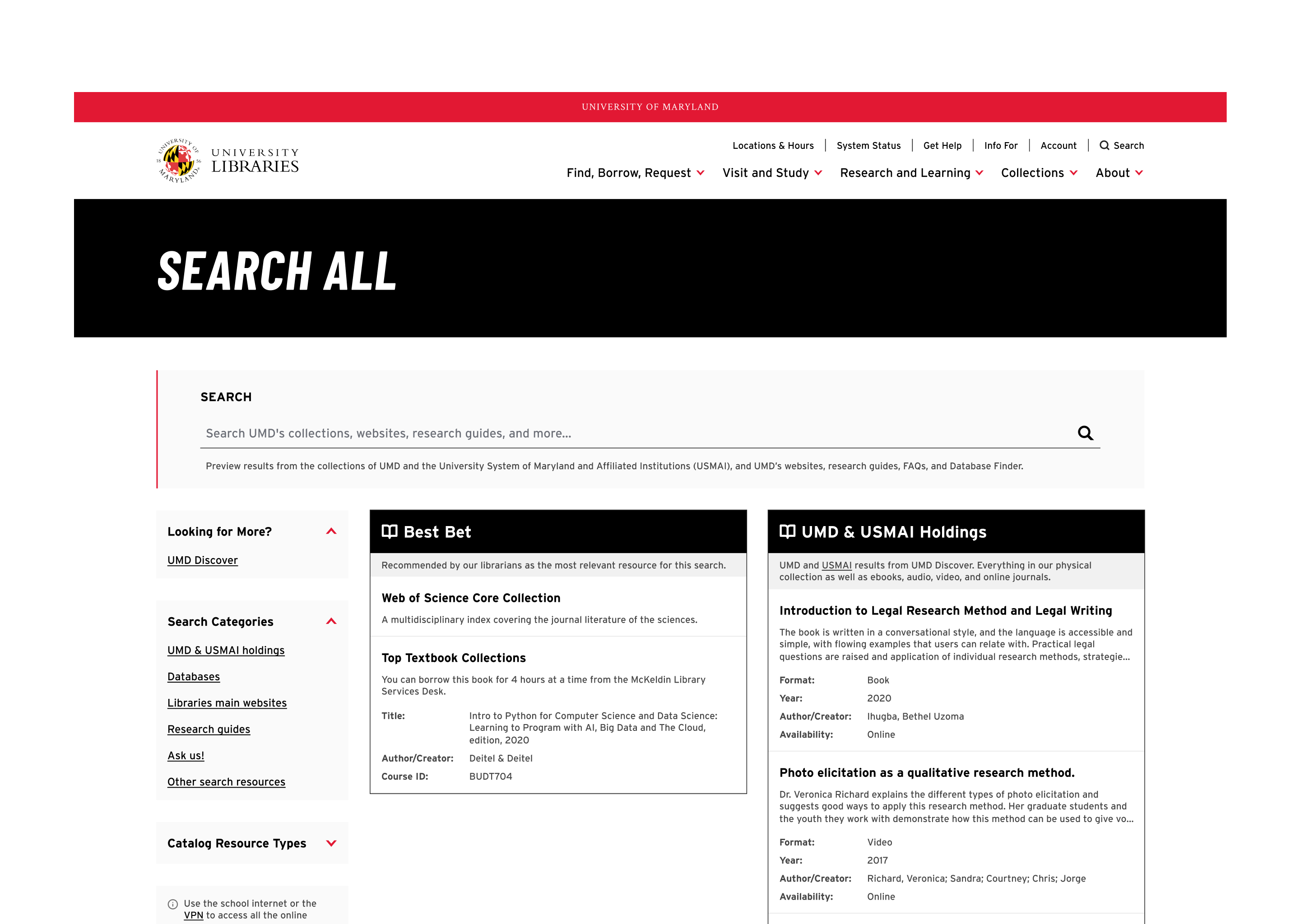
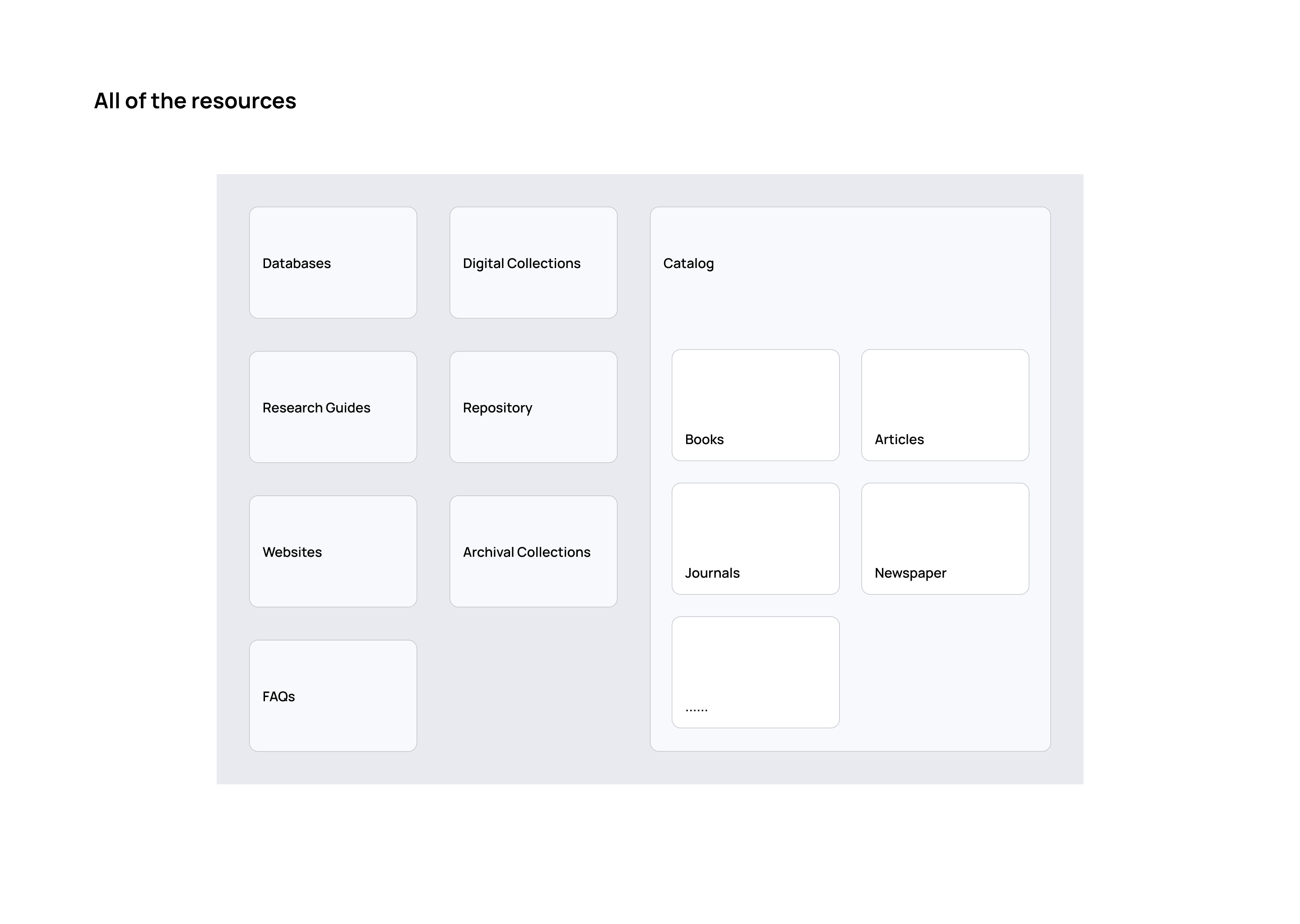
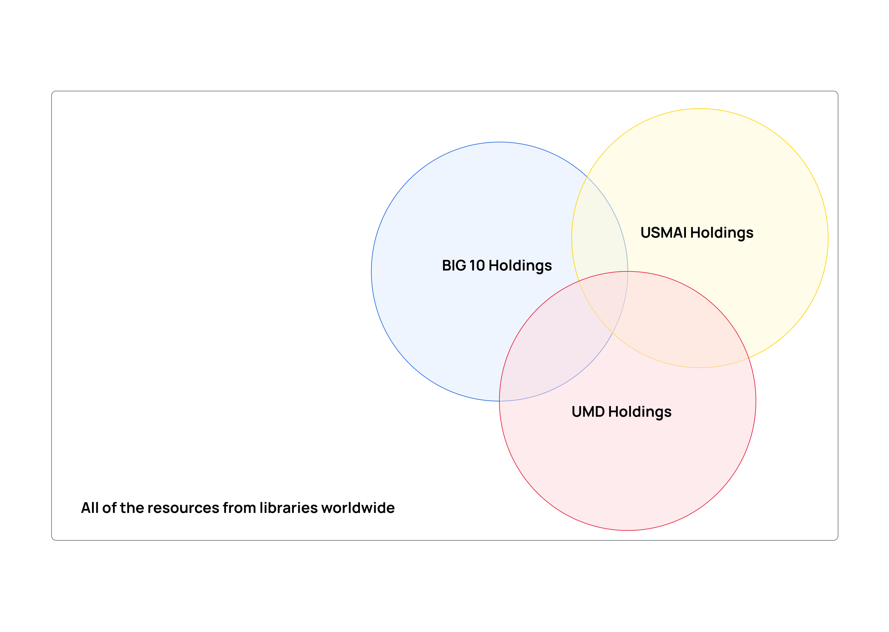
Resources were previously divided by holdings from different institutions and academic alliances. But users don't care where a resource comes from — they care whether they can find it and access it. I expanded the catalog's search coverage to include all holdings, paired with clear availability labels, so users see the full picture of what's available.
3. Provide instructions
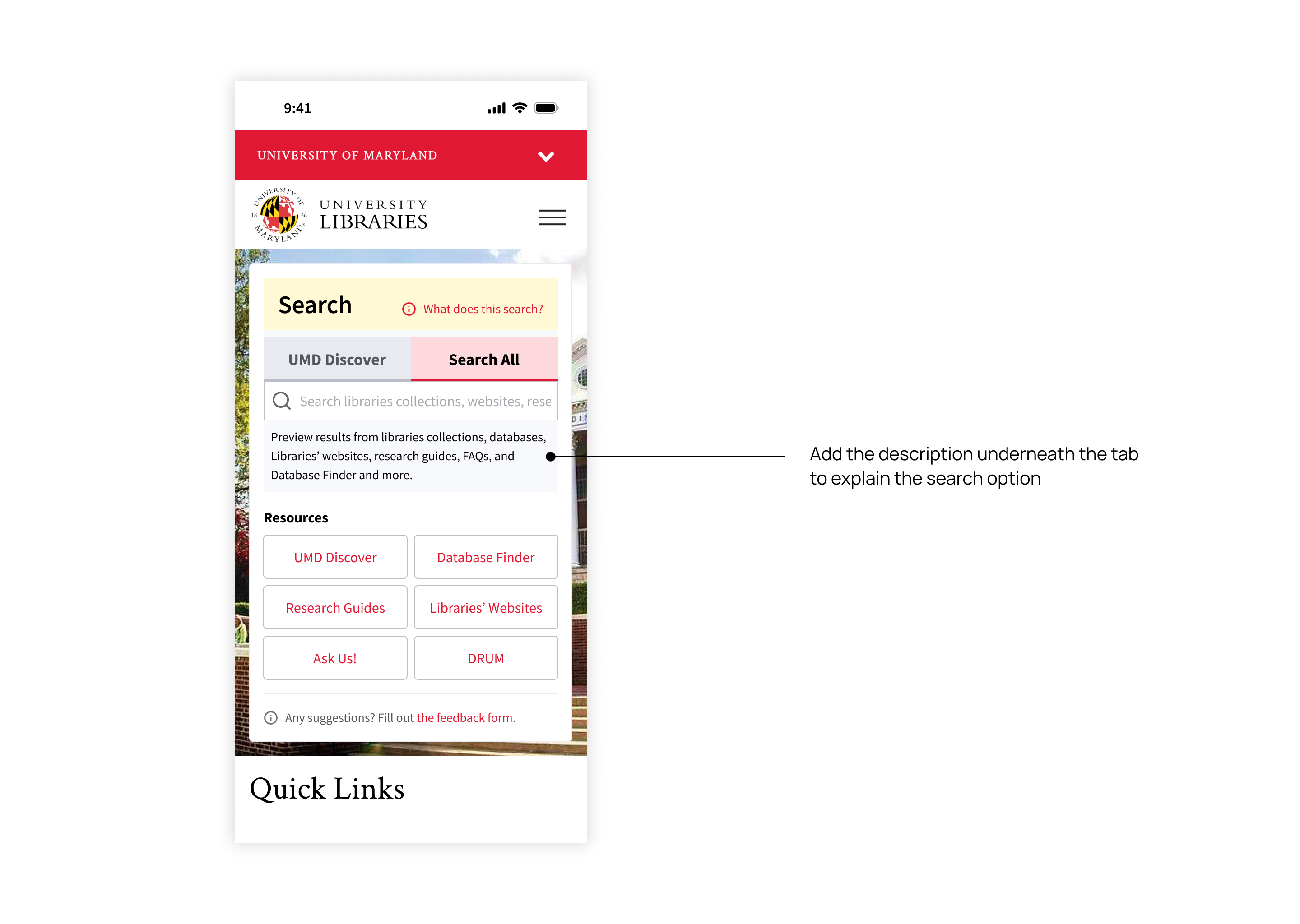
Library terminology is dense and consistently confused users. I added inline explanations across the interface to help users understand and navigate — for example, a short description under the tabs clarifying the difference between the two major search tools.
Design
The final designs span the homepage entry point, the two main search interfaces, and the mobile adaptation — each surface applied the same principle: surface the catalog by default, label availability clearly, and keep guidance close at hand.
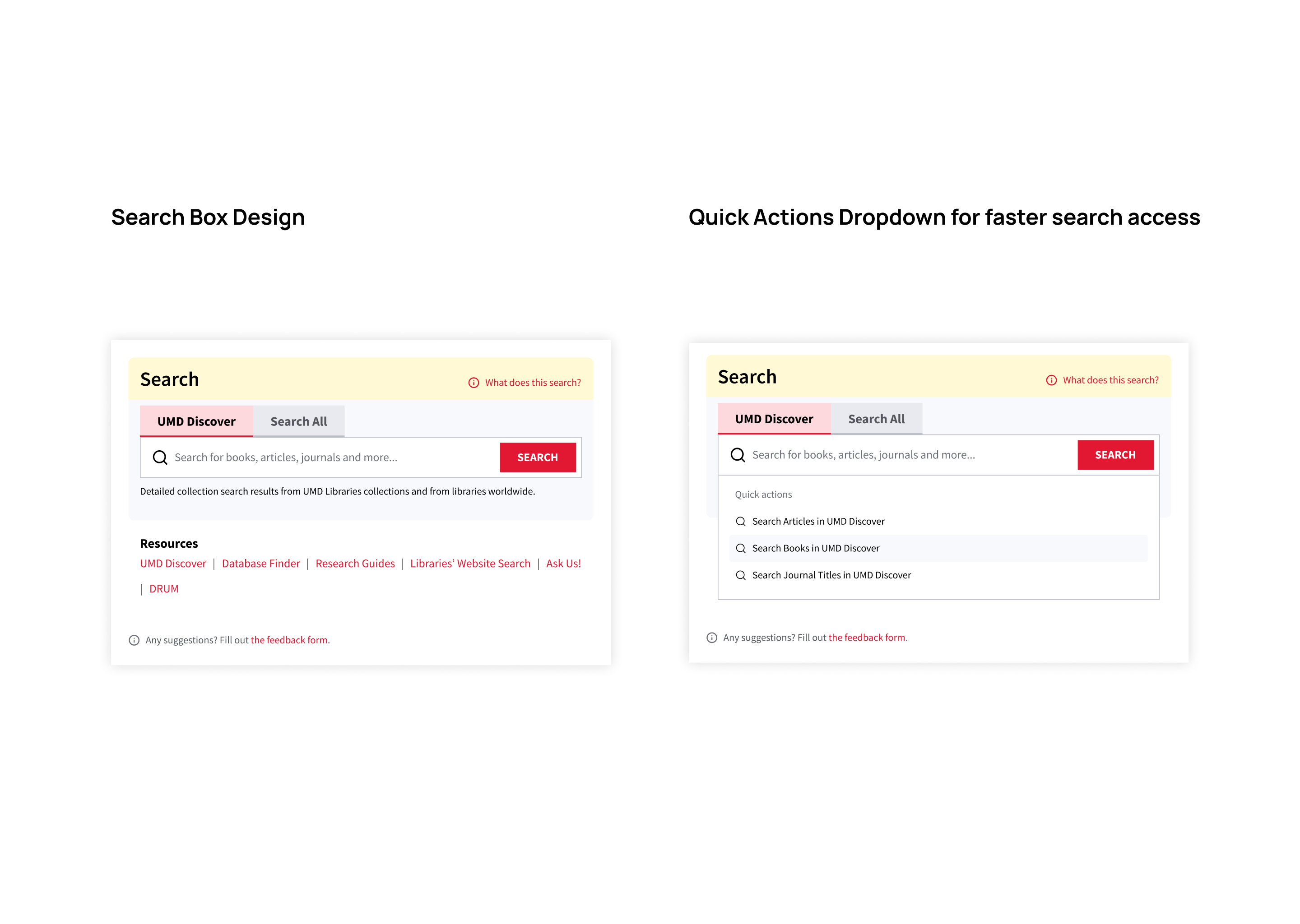
The search box
The search box uses a two-tab pattern — only two options, so cognitive load stays low — with a one-line description that updates per tab, so users always know which tool they're searching. On focus, a quick-actions dropdown surfaces the catalog's distinct resource types, answering the research signal that users want fast, direct access to specific formats.
On mobile, the search box keeps the two-tab pattern, with resource shortcuts expanding into tappable buttons for direct access to specific tools. Search All keeps full desktop functionality, with facets collapsed by default so results surface immediately on small screens.
Search related interfaces
Search All (Resource Overview Search) was aligned to the design system rather than removed. Catalog results stay visible alongside other holdings, with explicit scope labels and inline descriptions throughout, so users always know where each result comes from.
UMD Discover (Catalog Search) — the Primo-based catalog interface — was customized to match the UMD Libraries design system; deeper customization of the vendor interface sat outside this project's scope.
The redesign is now live — explore the interface in context below.
Live Product
UMD Libraries Homepage
Results
Impact
- Shorter user journey
Users reach the resources they need faster, without navigating across several interfaces. - Clearer guidance
Inline descriptions give users a clear understanding of which tool or resource they're using. - Lower learning curve
Removing the need to navigate between interfaces makes the library website more approachable for first-time users.
Reflection
- The biggest UX wins aren't always visual.
The single most impactful change in this redesign wasn't a new component or a new layout — it was making the catalog the default search tool. A configuration decision outperformed every interface change I considered. The instinct to redesign the surface is often worth resisting until you've ruled out the simpler lever underneath. - Design around user mental models, not institutional ones.
Holdings, alliances, and consortia matter to librarians; they don't matter to patrons. Mirroring the org chart in the UI created friction no amount of polish could hide — the scope expansion only worked because I stopped treating institutional boundaries as user-facing categories. - Frame the problem before solving it.
When the work first landed, it looked like an interface problem — the bento layout was confusing, the tools were unclear, the terminology was dense. Triangulating interviews, surveys, and analytics reframed it as a defaults problem, and the right framing made the solution nearly obvious.
Upcoming Updates
The new design system is set to release in mid-2026 — the interface will be refreshed, but the overall search experience and user flow will remain the same.